JMM INDUSTRIAL DESIGNER
A case study of the product development process for industrial design at SharkNinja, through the Shark StainStriker project (codename: TRITON) in 2022.
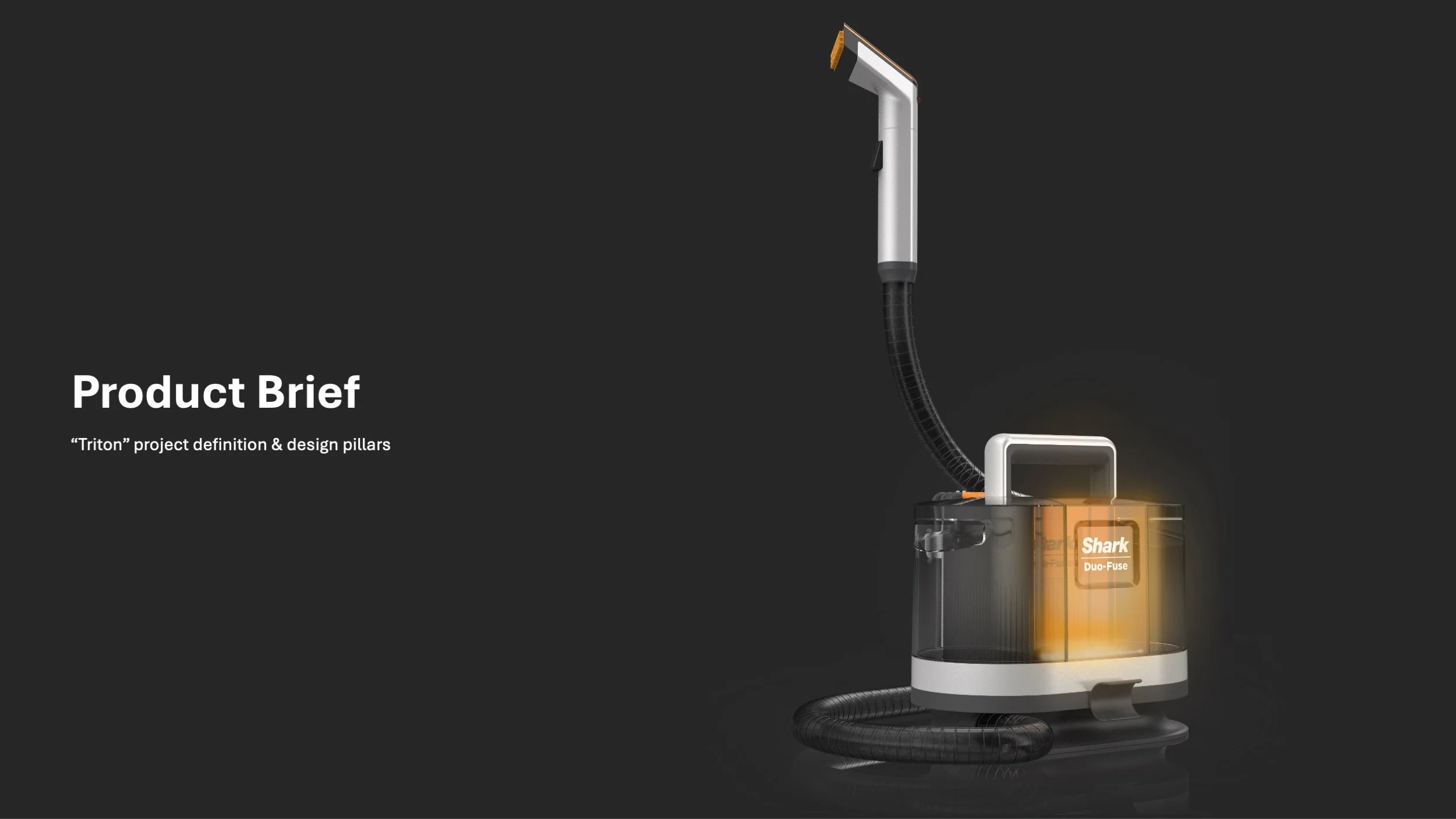
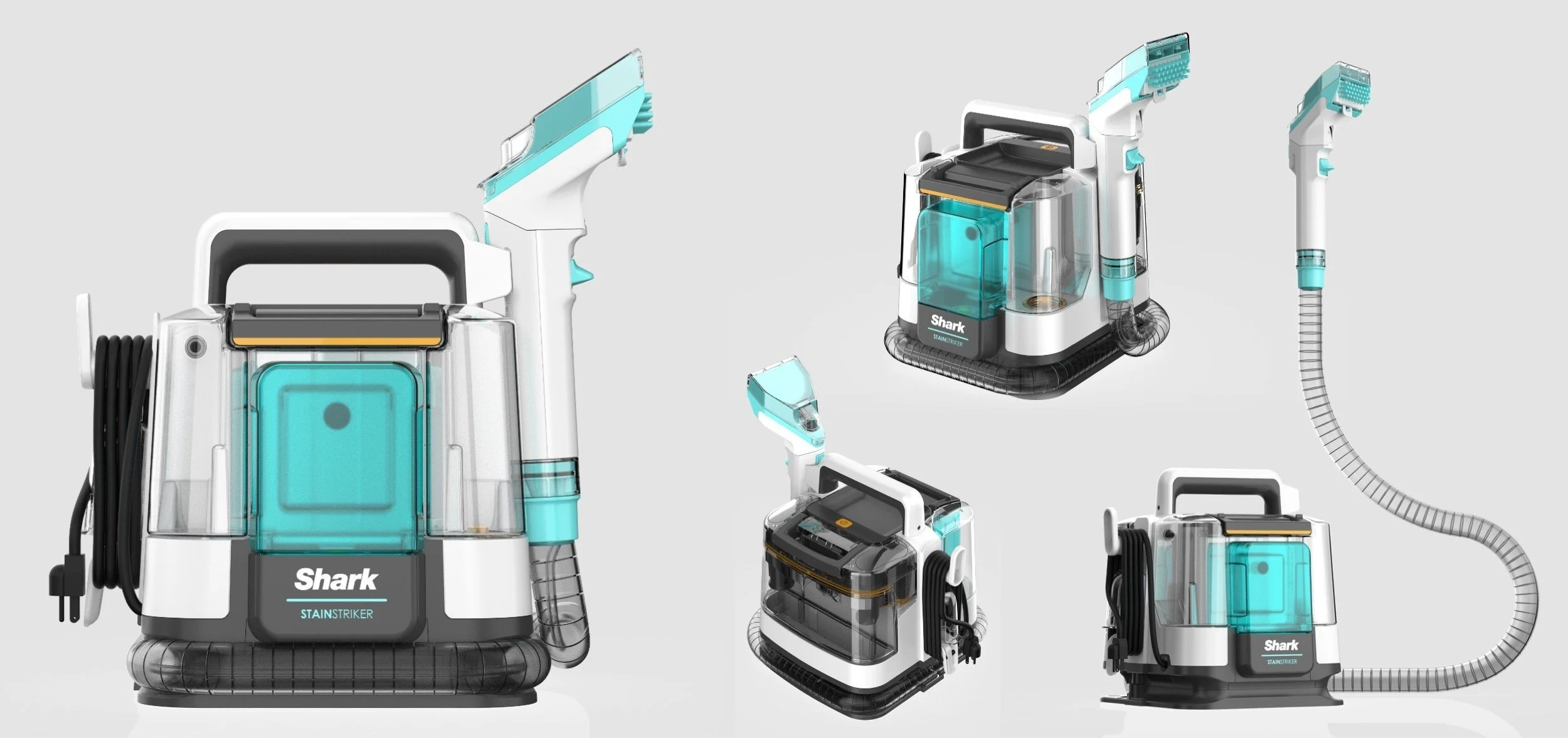
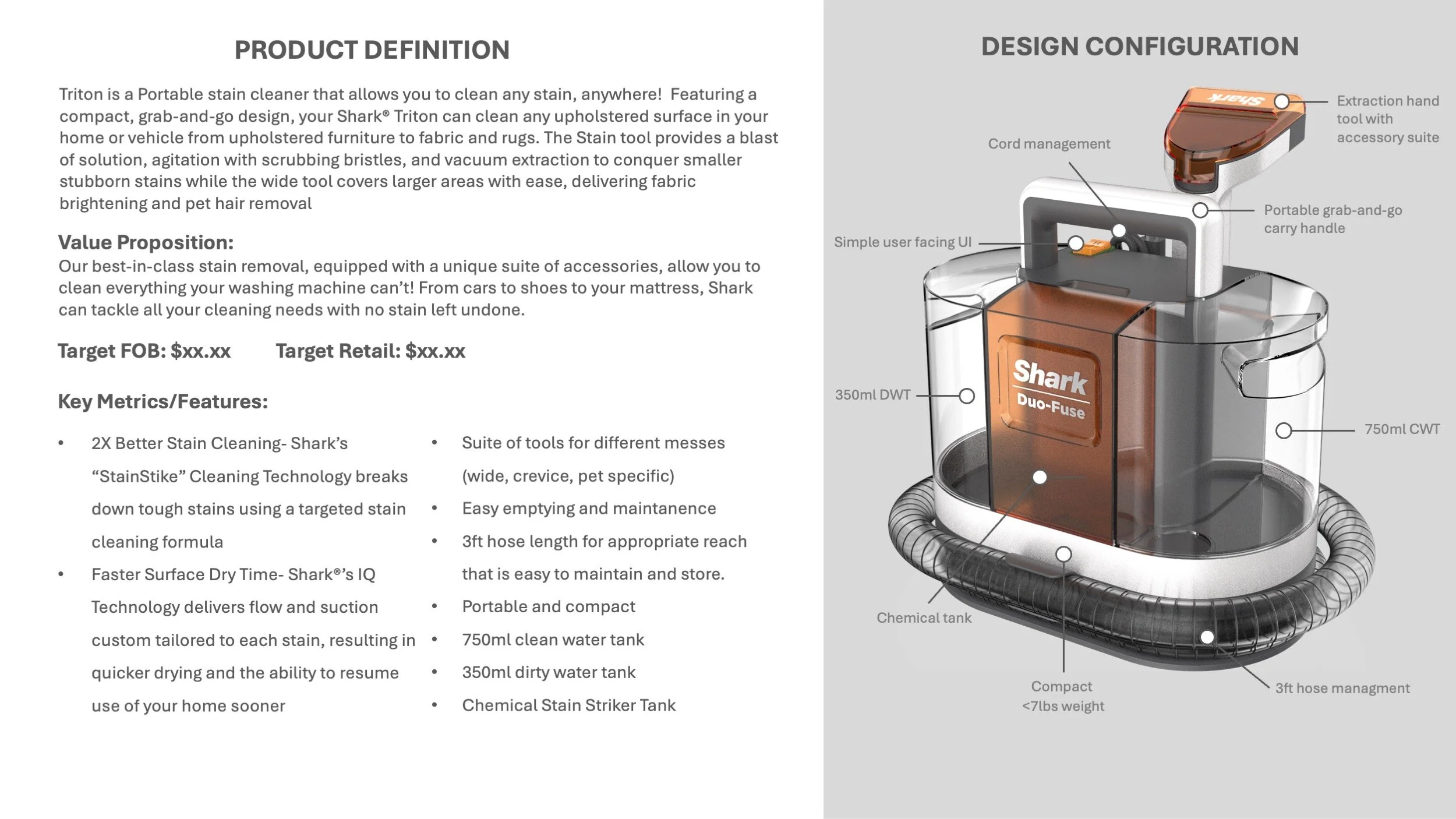
Triton - Product Brief Overview
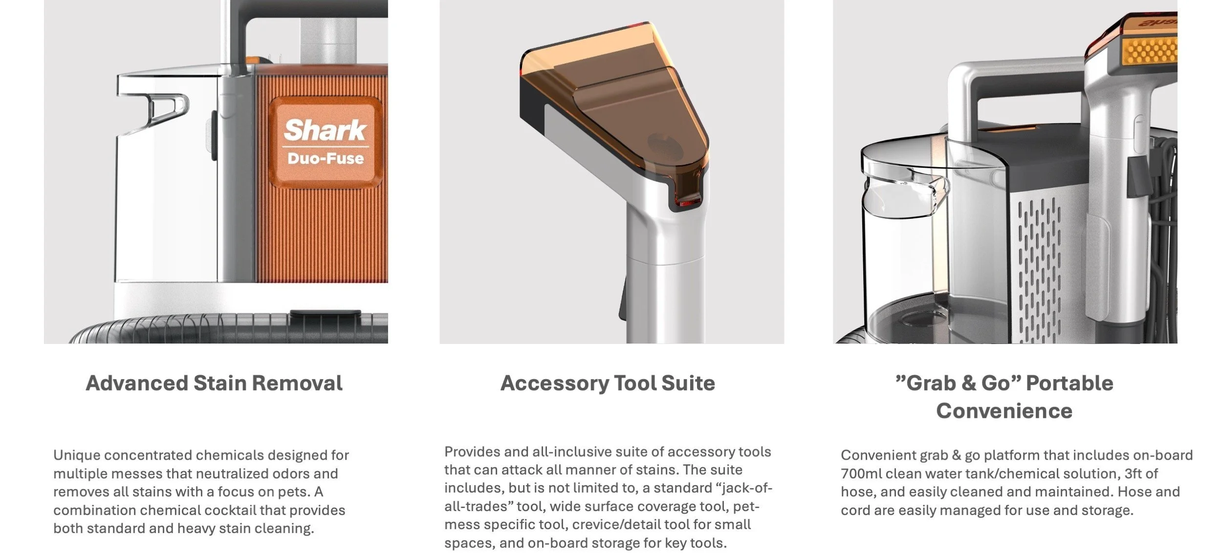
Triton - Product Design Pillars

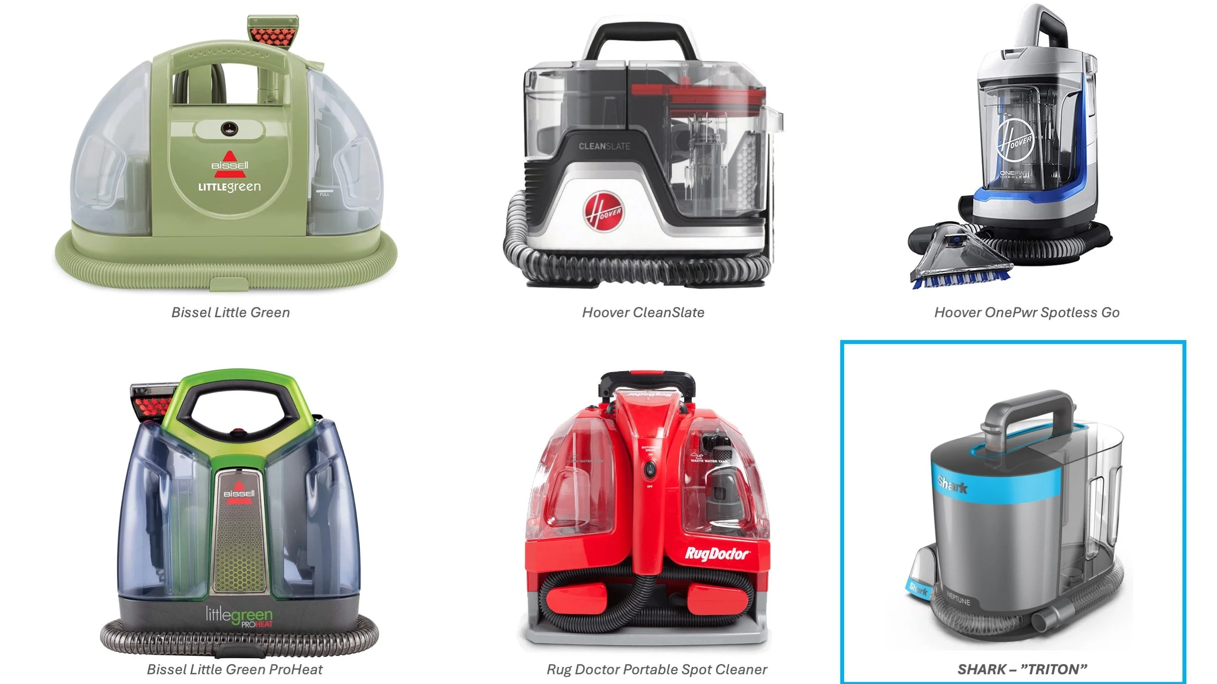
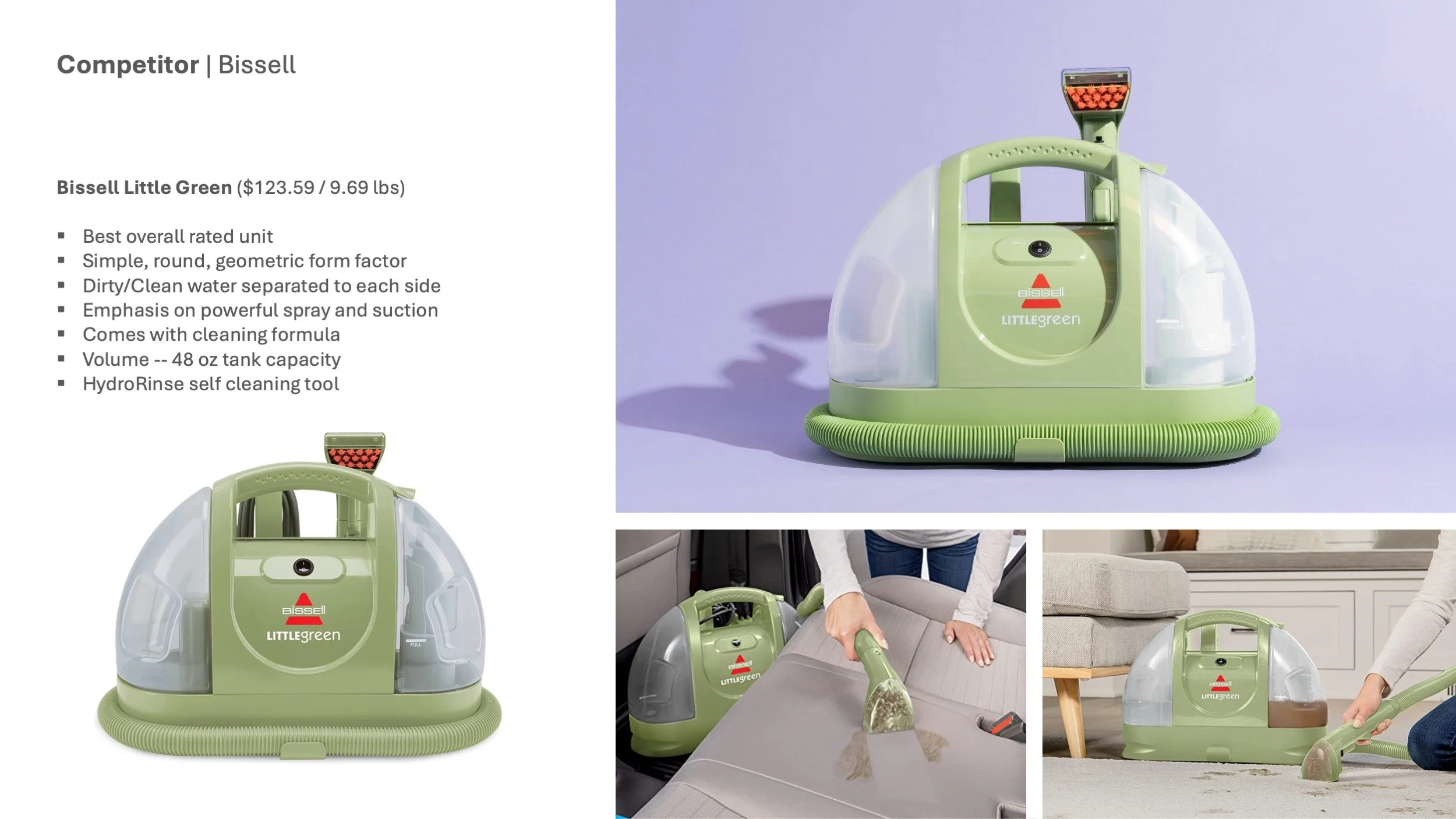
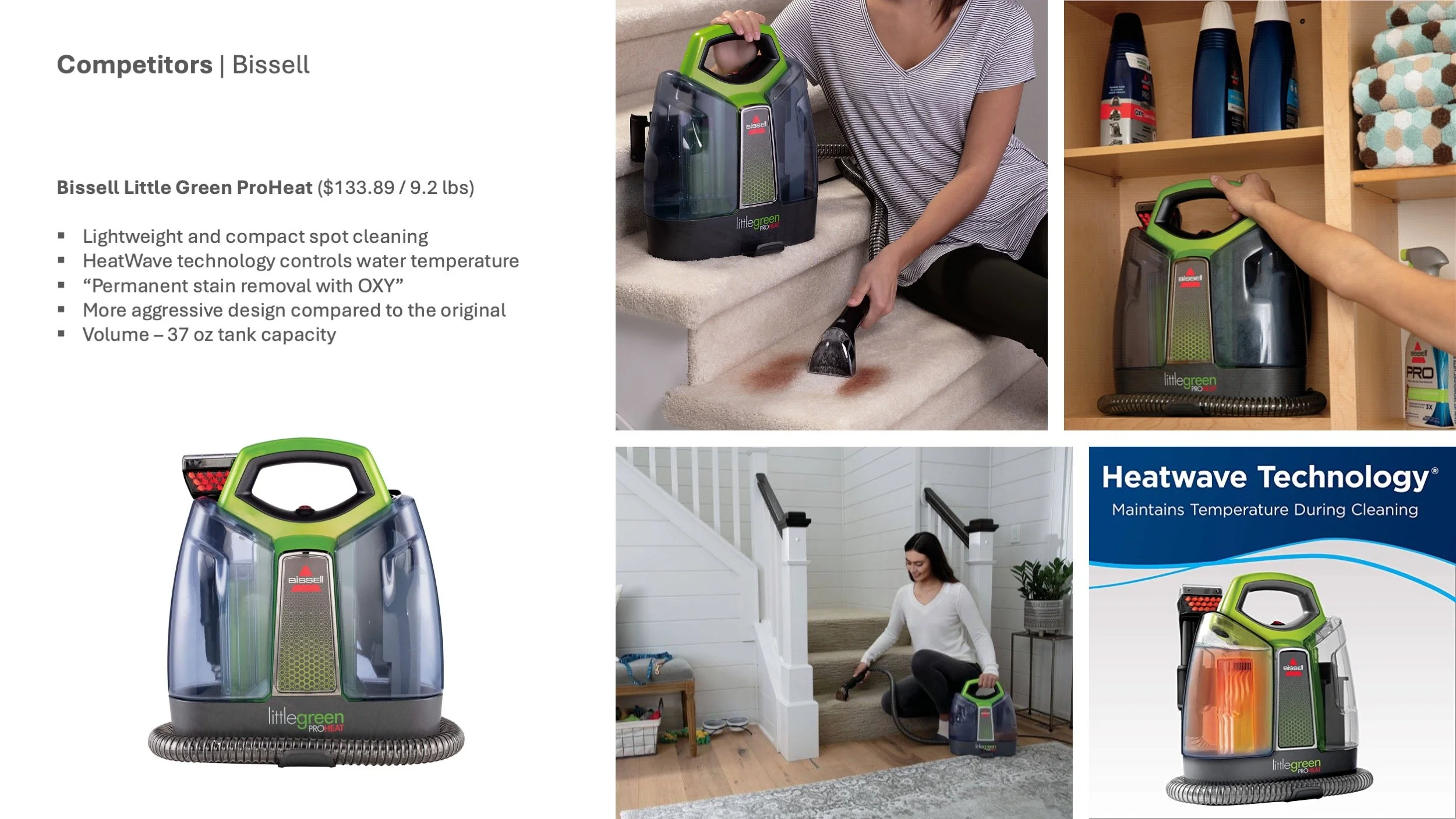
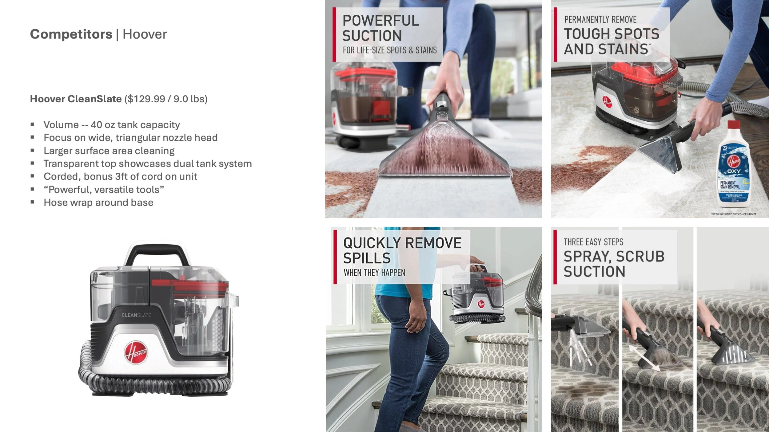
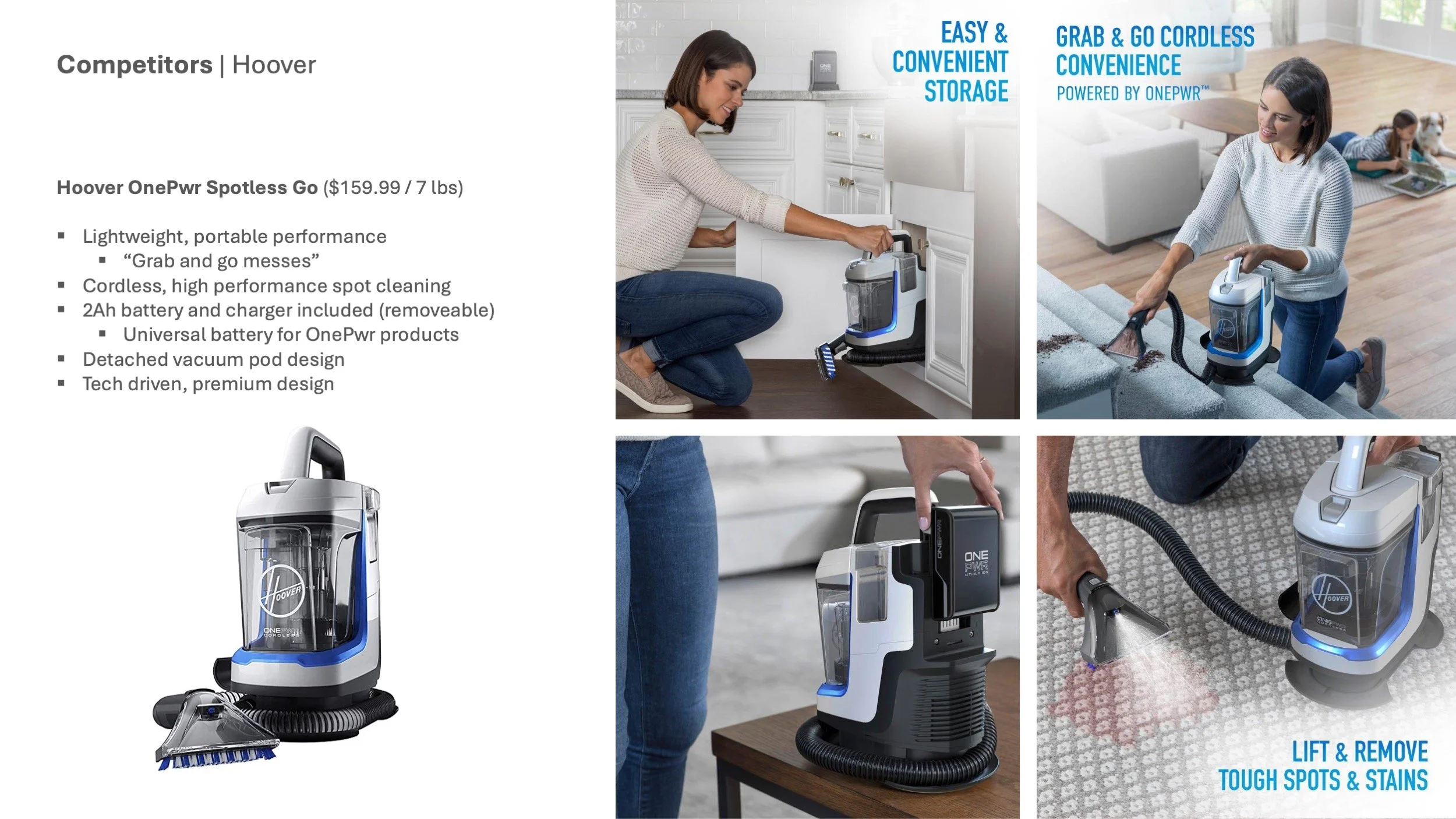
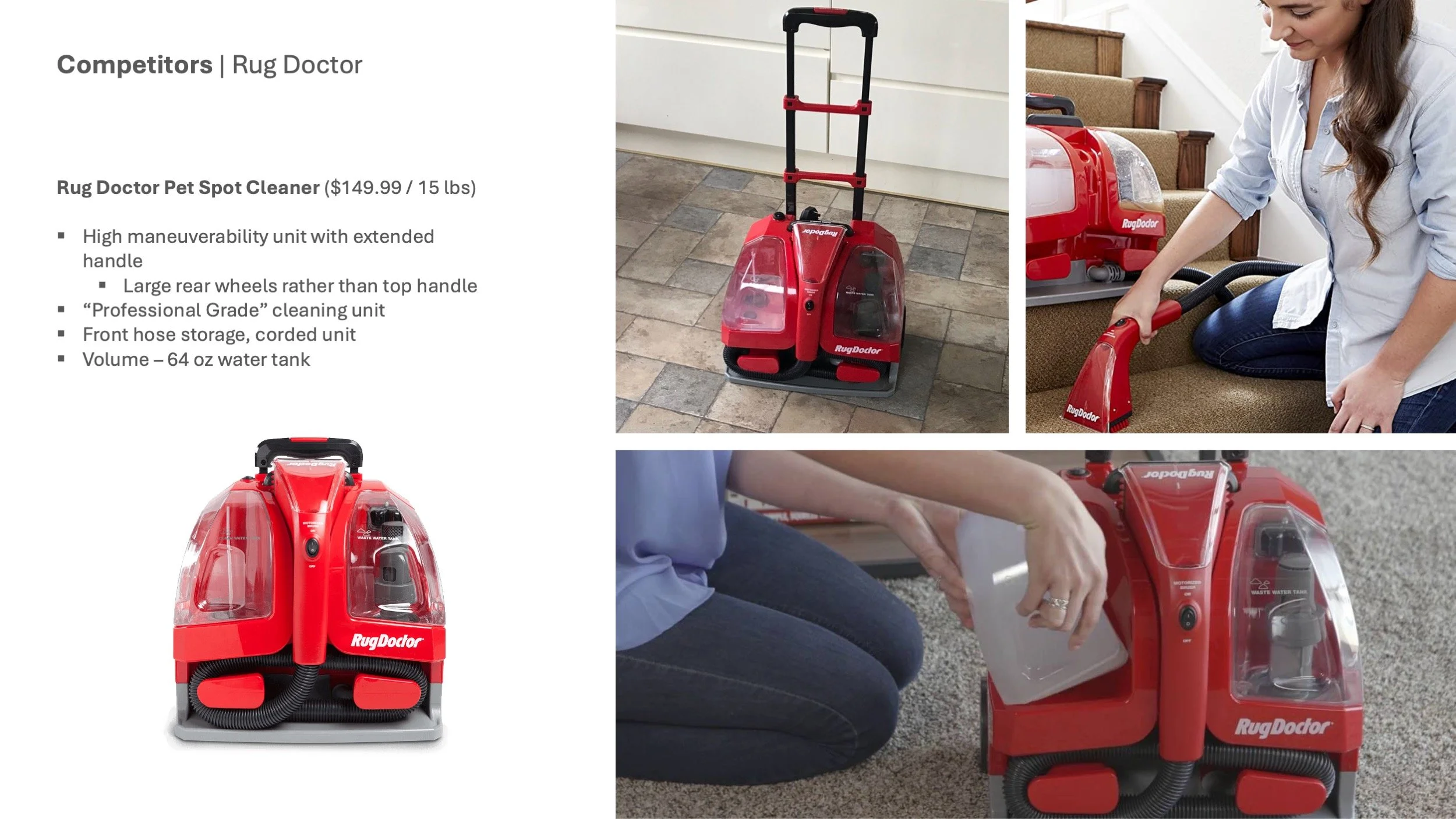
Triton - Spot Cleaning Competitor Analysis
The “Triton” project was Shark’s first foray into the spot cleaning extraction category. The ID team conducted research on the competition within the category, evaluating the designs, product features, and price points. We had to ensure that Shark was coming in with something new, innovative, and unique to disrupt the category and earn our right to be in the space.
Hoover CleanSlate - Competitive Deep Dive: User Journey
The ID team selected the Hoover CleanSlate spot cleaner to use in an actual case study to further understand the UX and really see how the top-line units in the category perform.
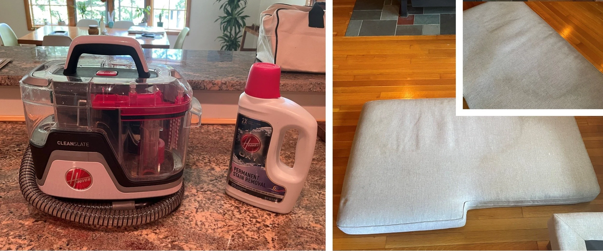
Hoover CleanSlate - Setup & Preparation
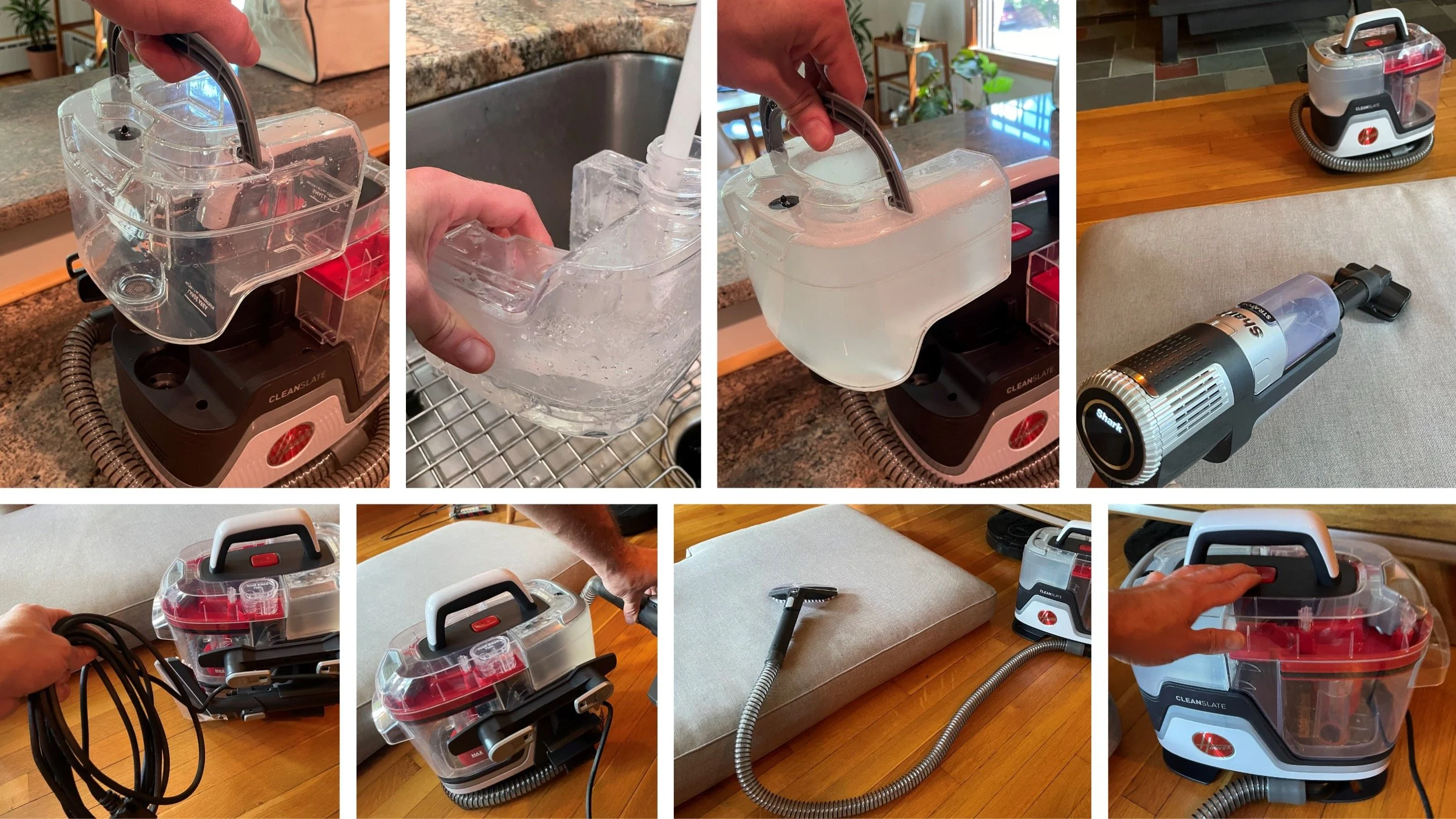
Hoover CleanSlate - In Use
First impressions
Spraying the stained area
Scrubbing and extraction
Extraction visual
Hoover CleanSlate - Emptying & Maintenance
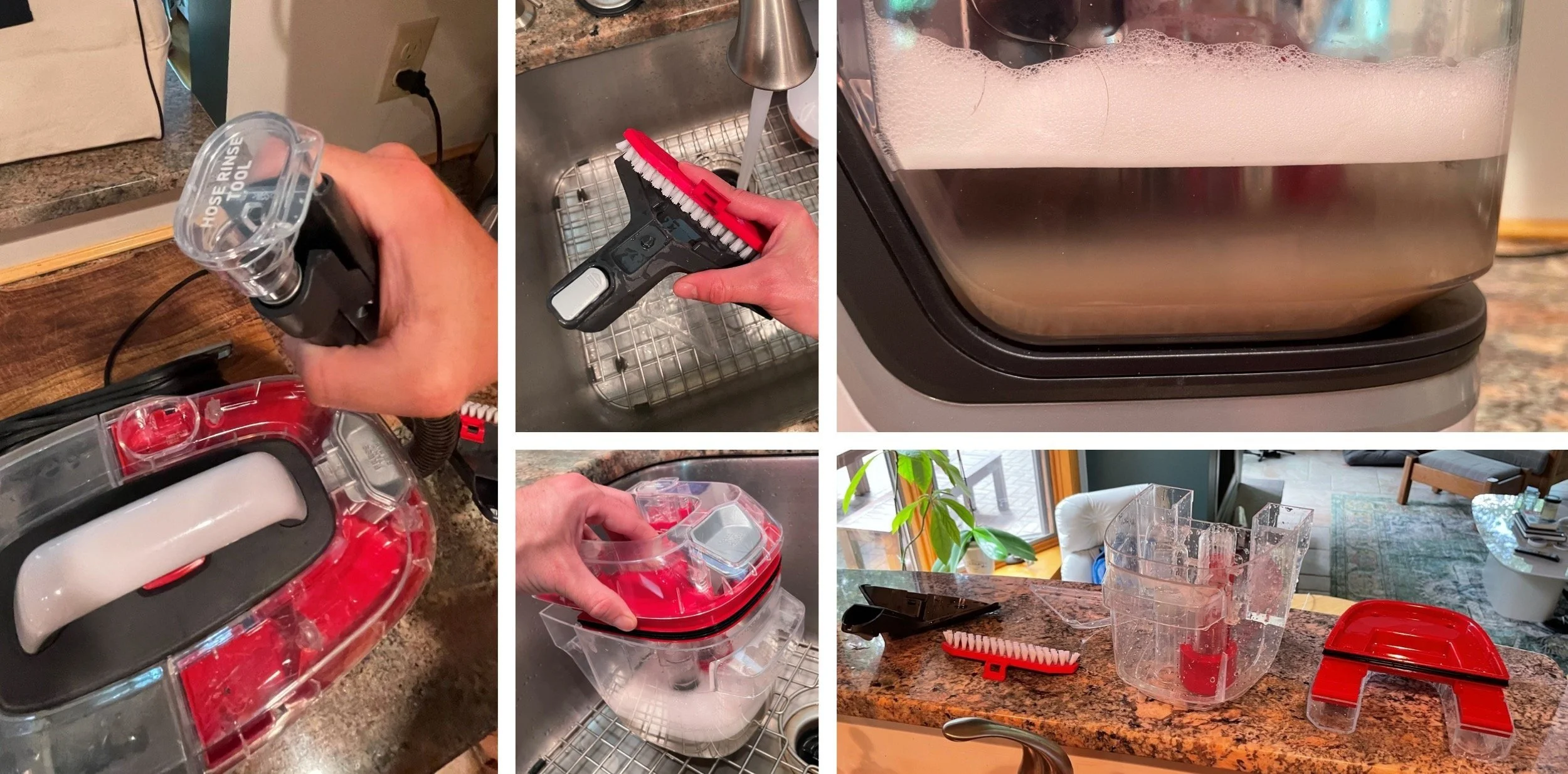
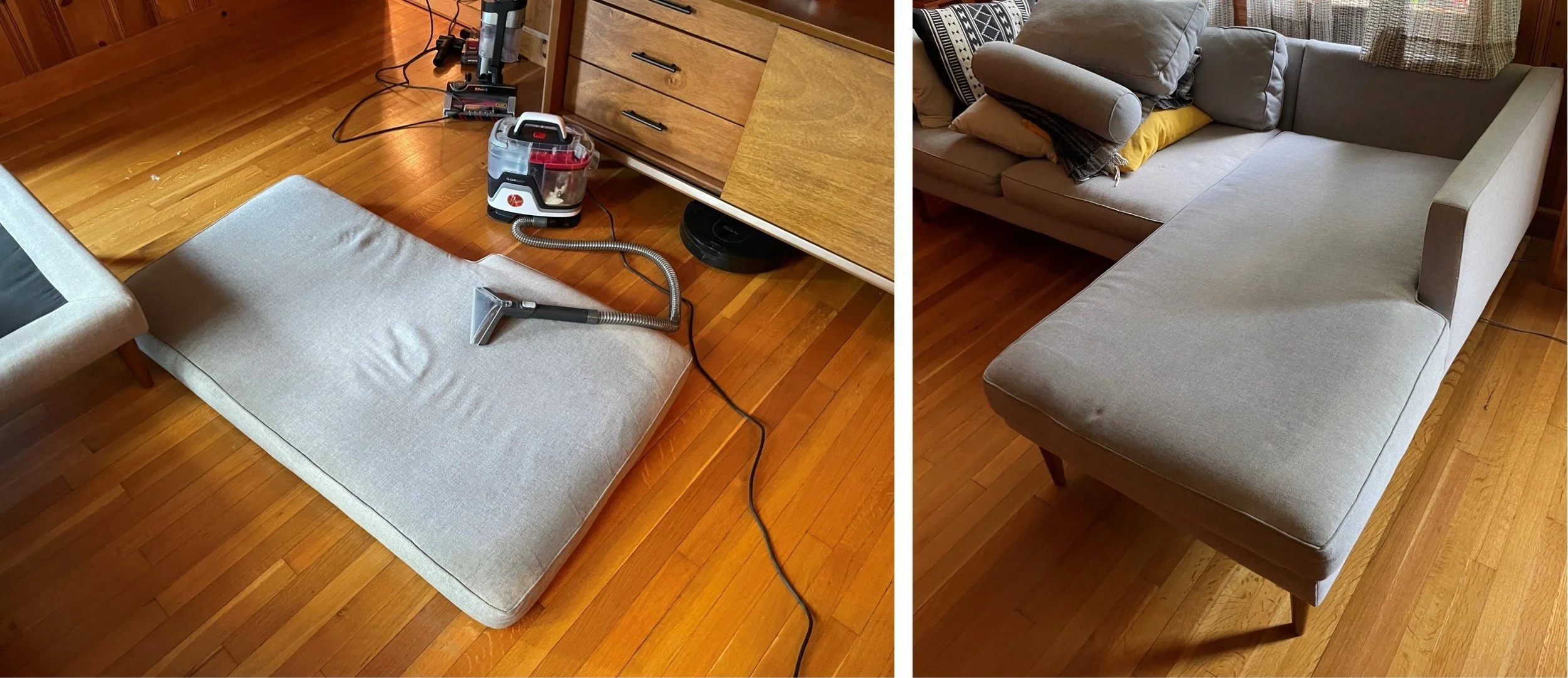
Hoover CleanSlate - Results
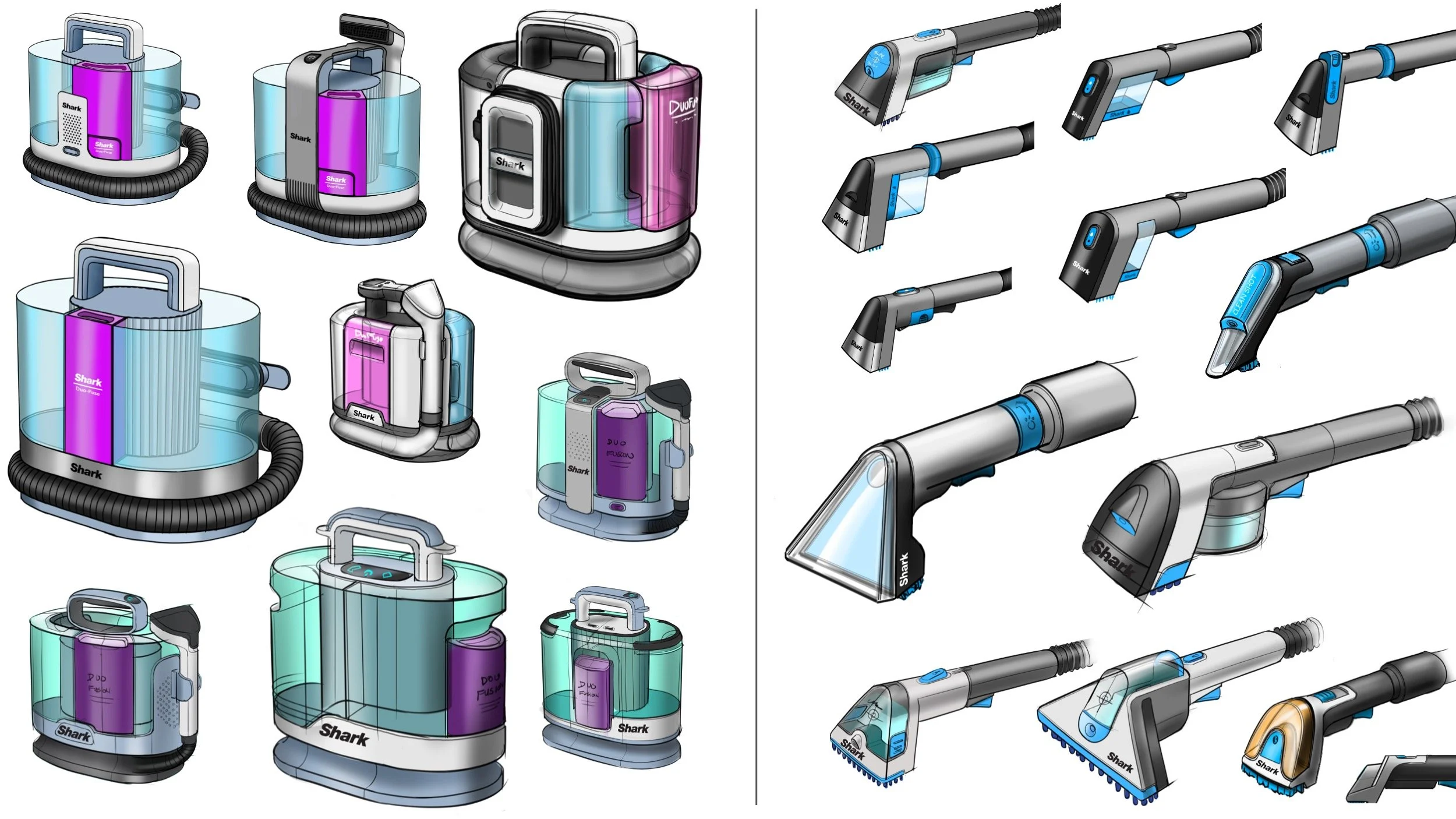
Triton - P0 ID: Architecture Concept Sketches
Working with our engineering team, ID kicked-off an initial concept sketch phase to begin informing the engineering underlay for components and layout while generating initial design gestures.
Pod Concepts Hand Tool Concepts
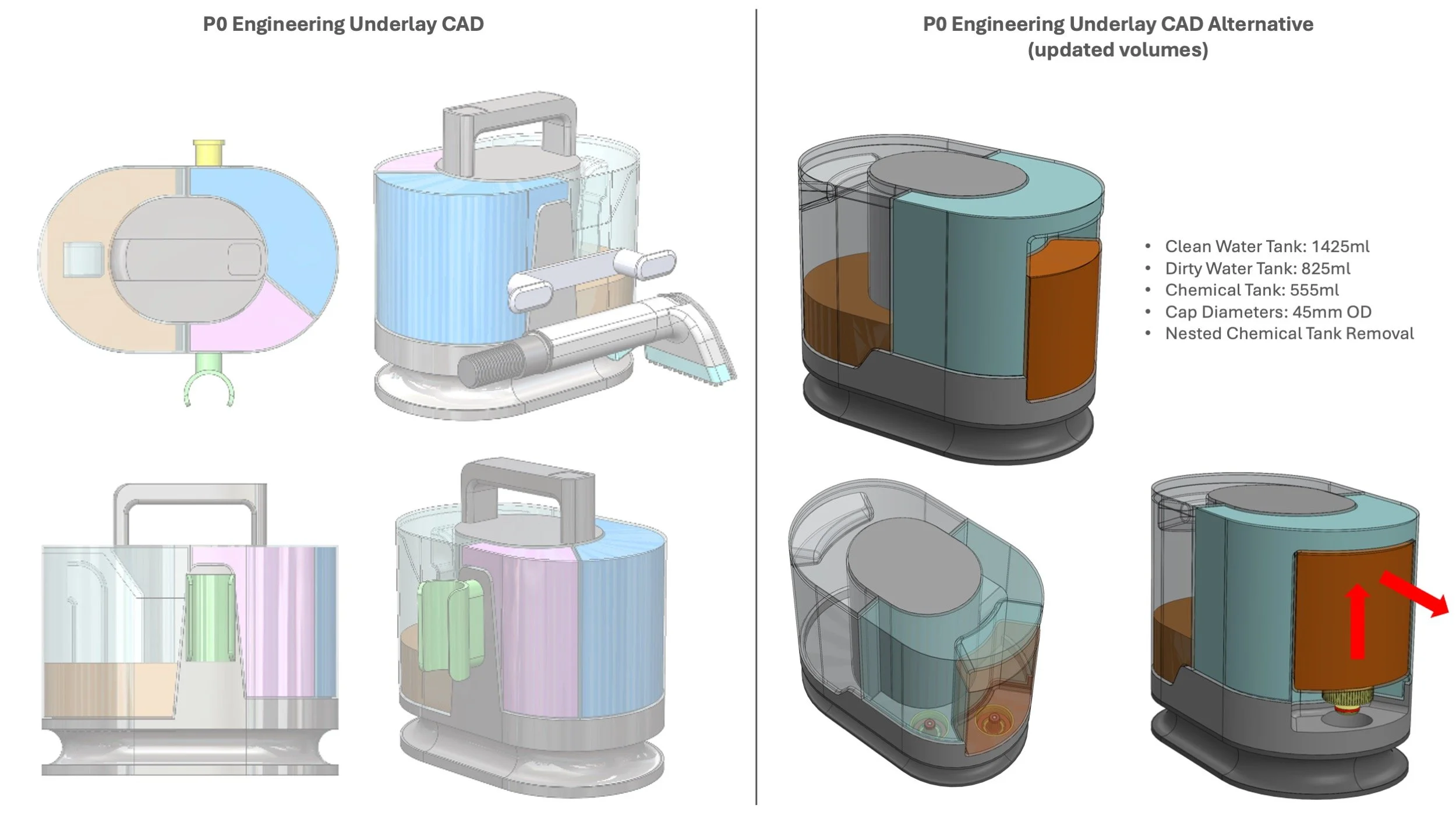
Triton - P0 ID: Engineering Underlay CAD
Working through our sketch concepts, the engineering team developed underlay CAD that could fit key components and volumes for ID to wrap CAD development around.
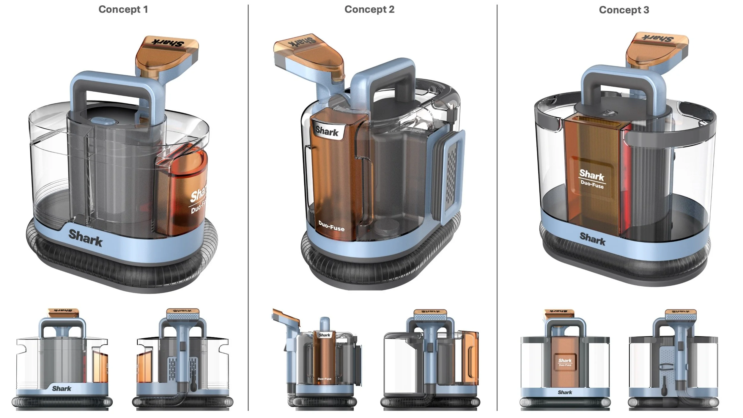
Triton - P0 ID: Initial CAD Concept Renders
We presented 3 concept directions to the cross-functional team to review and align upon a direction to chase for the P0 build.
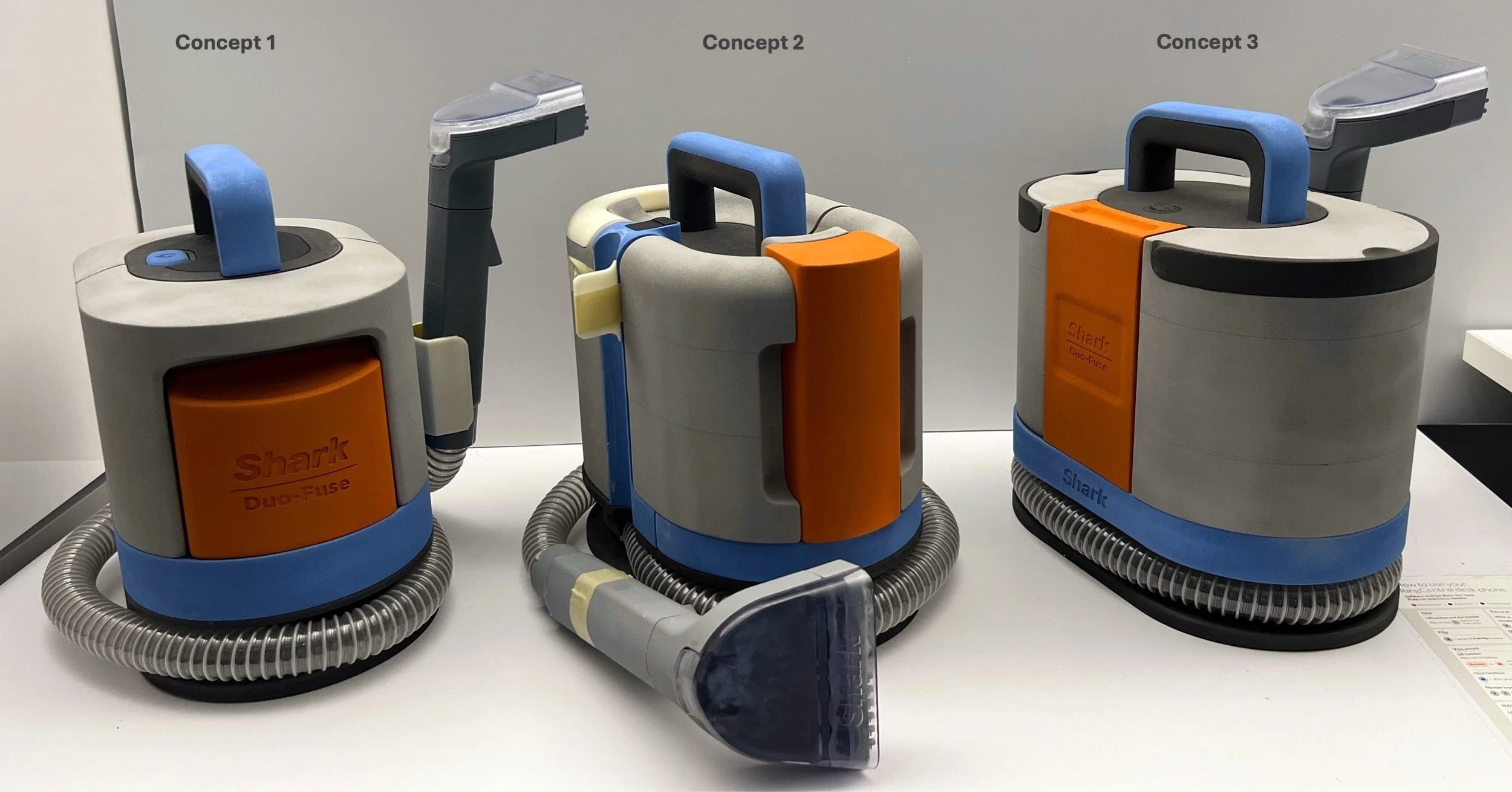
Triton - P0 ID: Concept CAD Foam Models
ID commissioned foam models of the concepts to evaluate size and baseline UX.
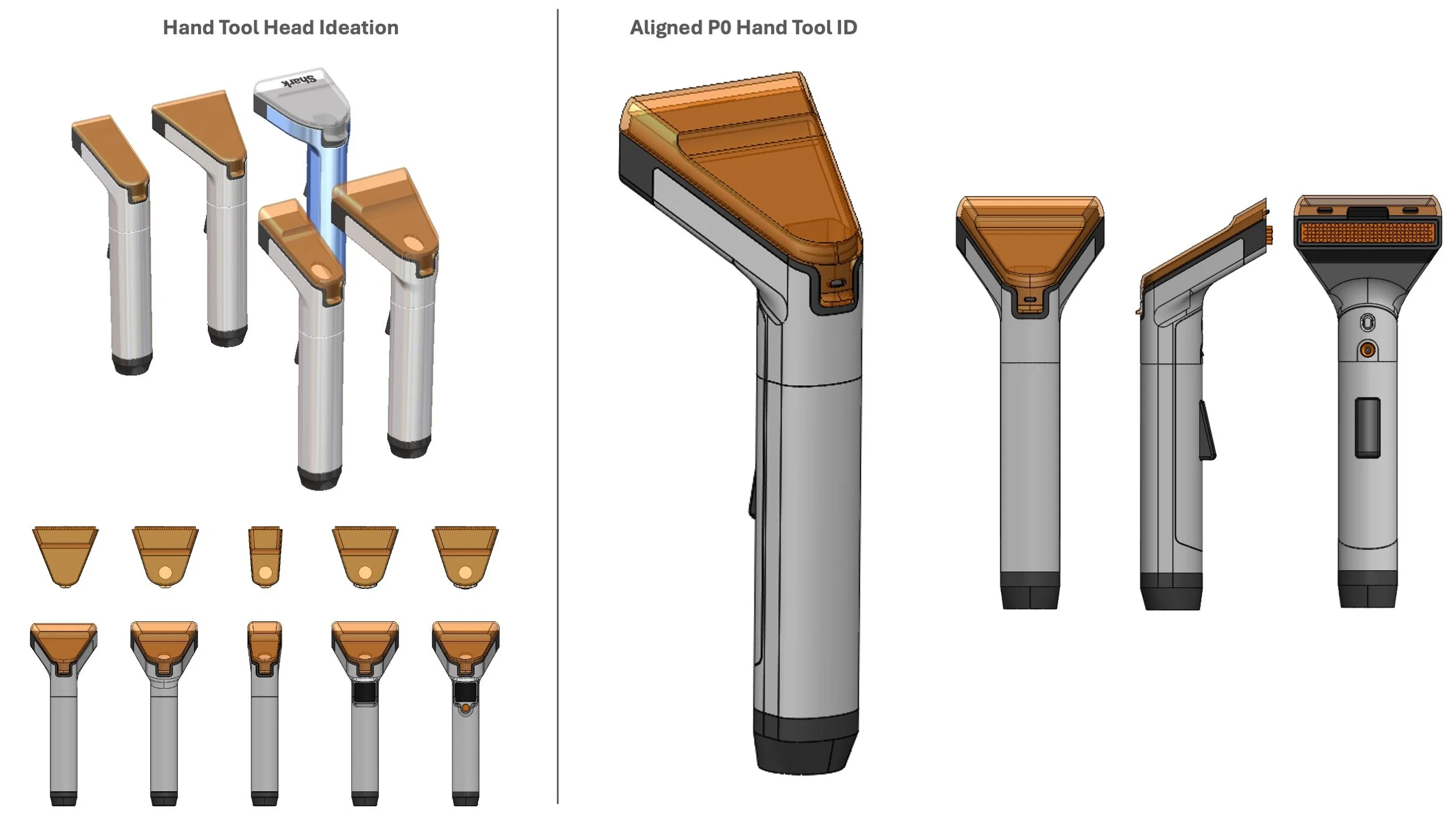
Triton - P0 ID: Hand Tool CAD Exploration
While the main pod was the general focus of the product, the hand tool was the pivotal component ID needed to ensure an amazing UX. ID CAD exploration produced an aligned design approach for the P0 build.
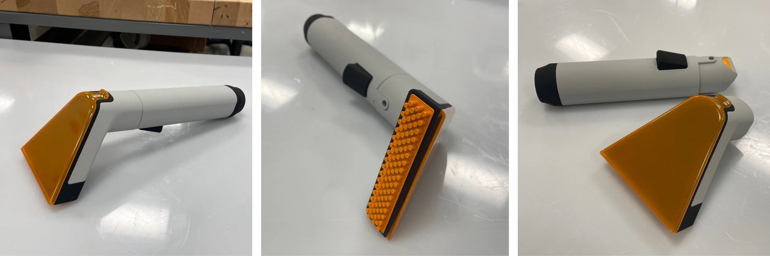
Triton - P0 ID: Hand Tool Foam Model
ID commissioned a foam model for the hand tool to evaluate the volume and feeling in hand.
Triton - P0 ID: Design Refinement
The team aligned to proceed with concept 3 for the P0 build. The ID team refined the concept and worked with engineering to prepare the design for its first functional build at P0.
Triton - P0 ID: Refined ID Foam Model
ID commissioned a final P0 ID foam model to get an early read on the volume, UX, and design of the P0 build.
Triton - P0 ID: Extraction “Family” Design Cohesion
The Triton program was being developed in tandem with Shark’s first upright extractor. Both programs relied on the same chemical and hand tool strategy, so it was important for the ID of both products to be cohesive and famalial. Our team worked directly with the upright extractor team daily to ensure cohesion and bounce concept ideas off one another.
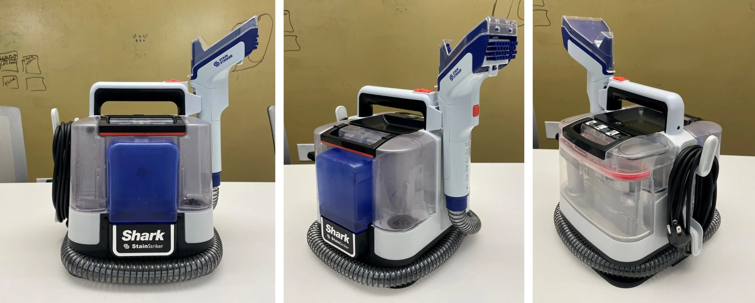
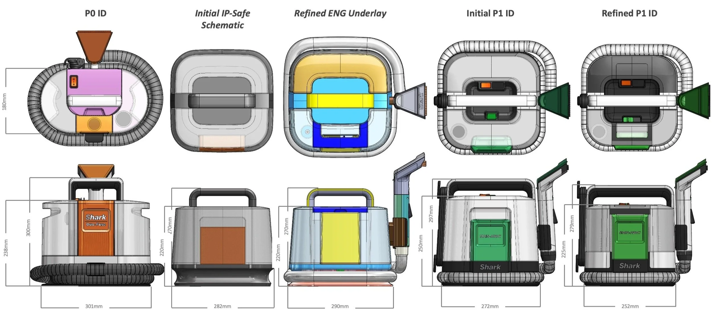
Triton - P1 ID: IP Architectural Pivot
Upon development of the P0 build, the legal team flagged the P0 design for IP infringement concerns due to the tank arrangement of the product architecture. The language of the patent required that “clean water and chemical tanks could not be on the lateral side to the dirty water collection tank. Unfortunately our P0 design infringed upon this and required the team to rethink the architectural arrangement to ensure IP safety as we made our first leap into the category.
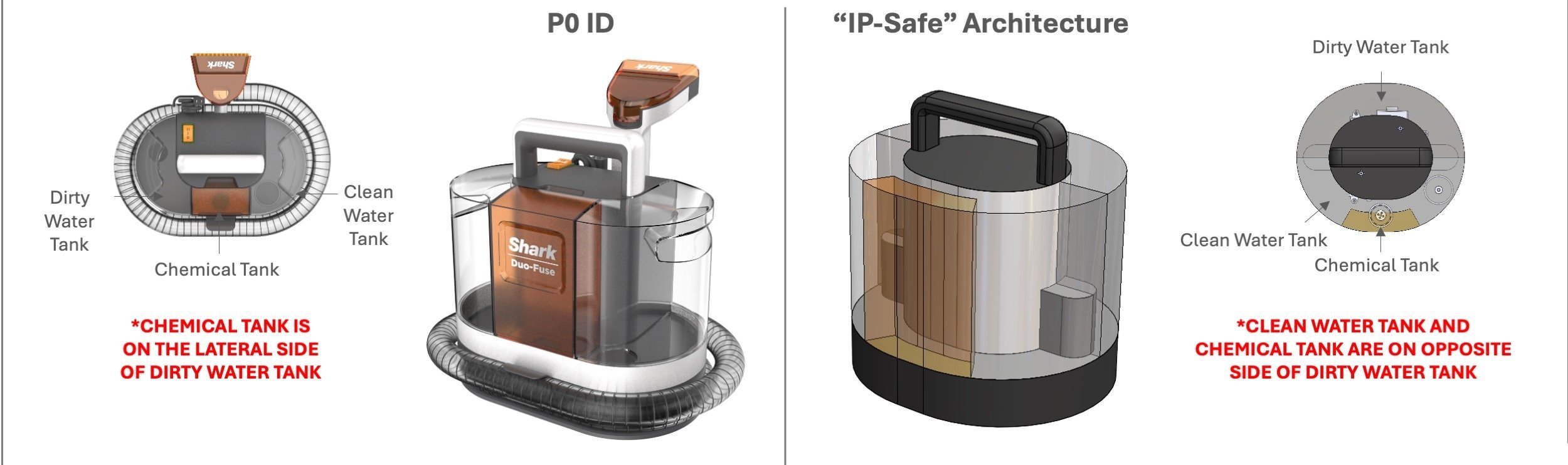
Triton - P1 ID: Tank Arrangement & Profile Exploration
We began ideating around new profiles,tank shapes, and arrangements to find a new design identity that provided a risk-averse entry into the extraction space. It was important to establish a front to back separation between the clean tanks and dirty tank.
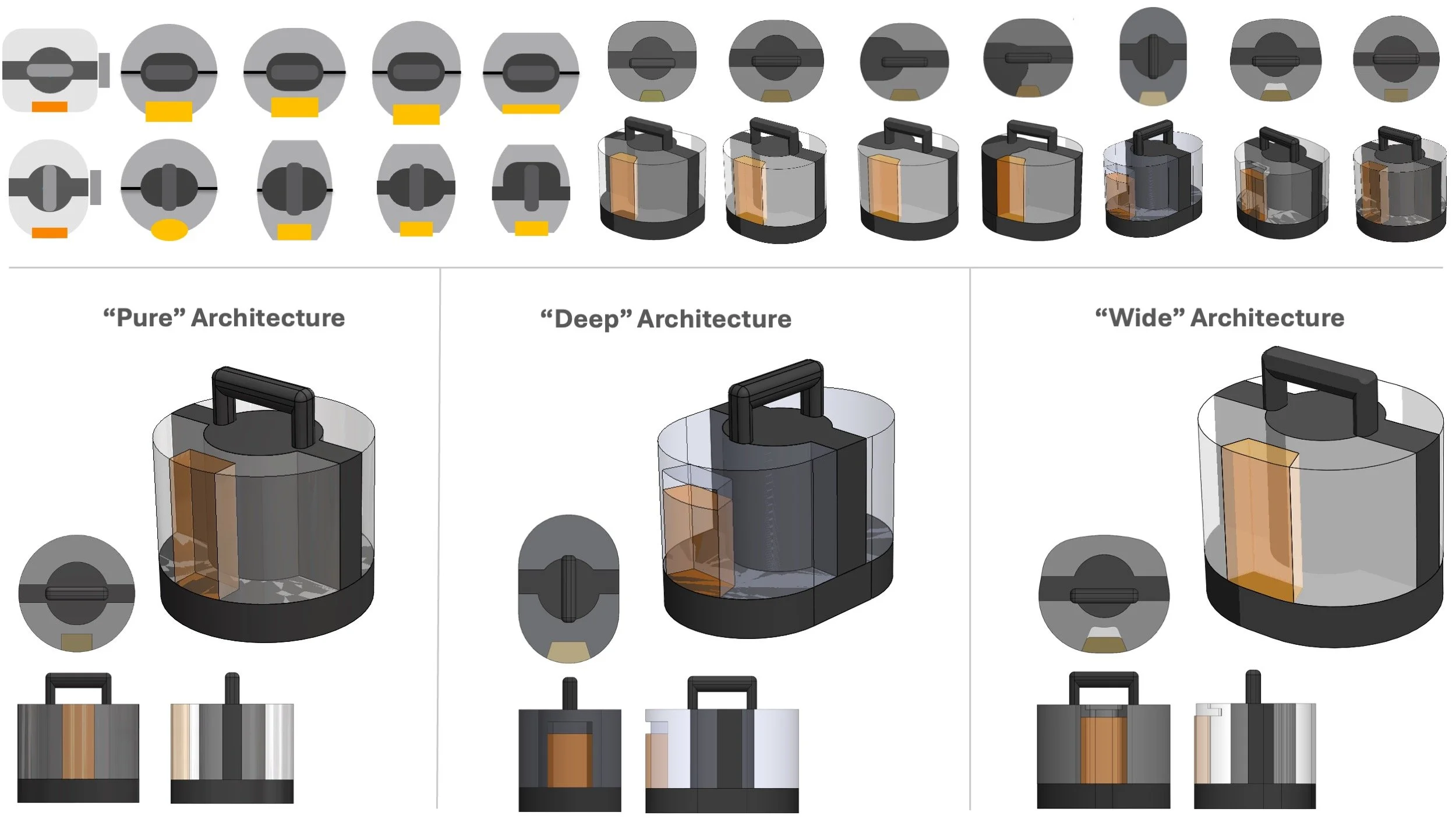
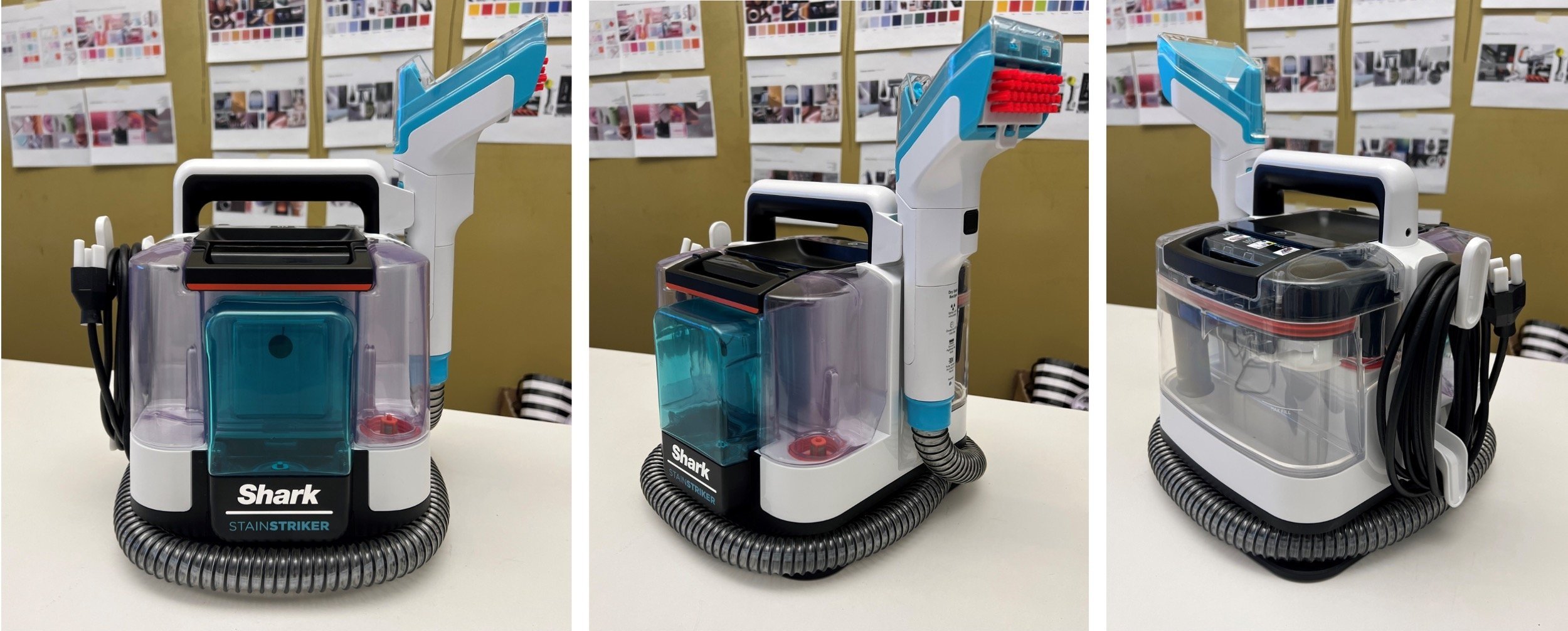
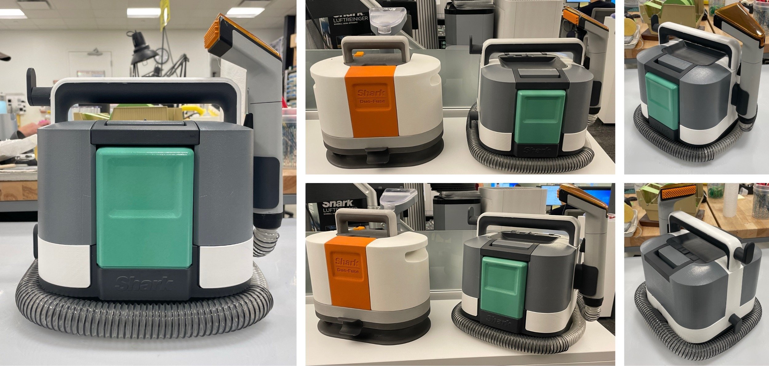
Triton - P1 ID: The “Cube”
After exhausting tens of options, the team gravitated toward the simplicity of the “Pure” architecture, but felt it wasn’t unique to the category. Additionally the round profile was not optimal to the internal layout and volume requirements. The team aligned to look at a rounded square profile that subtley tapered in a sort of “pyramid” gesture. The rounded square form also spoke well to the design language being developed on the floor extractor program.
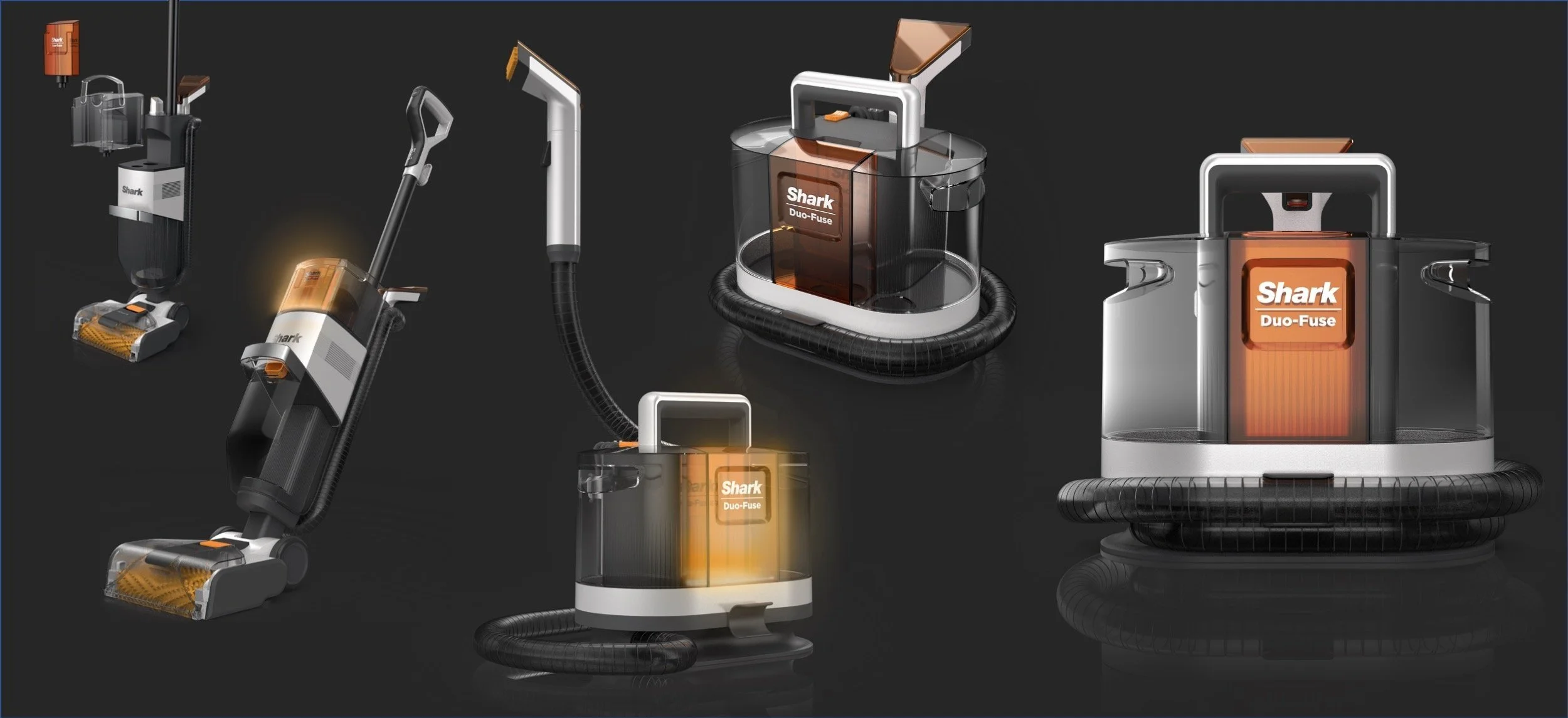
Triton - P1 ID: “Cube” Concept Renders
Triton - P1 ID: “Cube” Size Optimization
Through the P1 phase we were always conscious of size creep and wanted to ensure we maintained a compact, space optimized footprint.
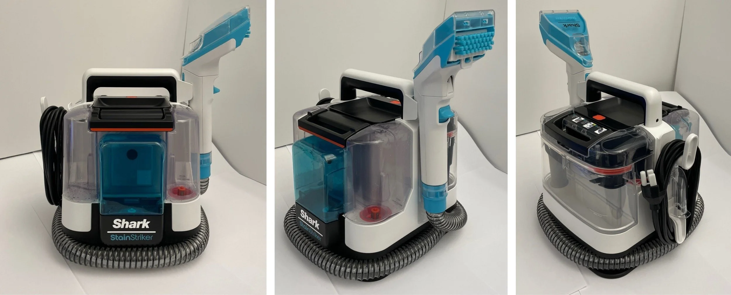
Triton - P1 ID: Refined Design
ID worked closely with the engineering team to dig in on refining the new “Cube” gesture, for manufacturability and performance for the P1 build.
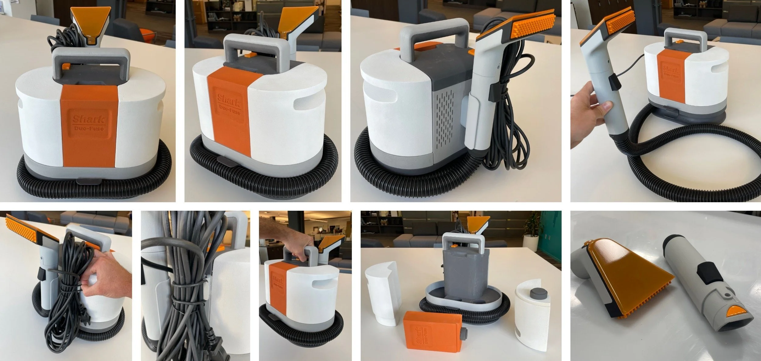
Triton - P1 ID: Foam Models
Triton - P1 ID: Hand Tool “Recipe” Development
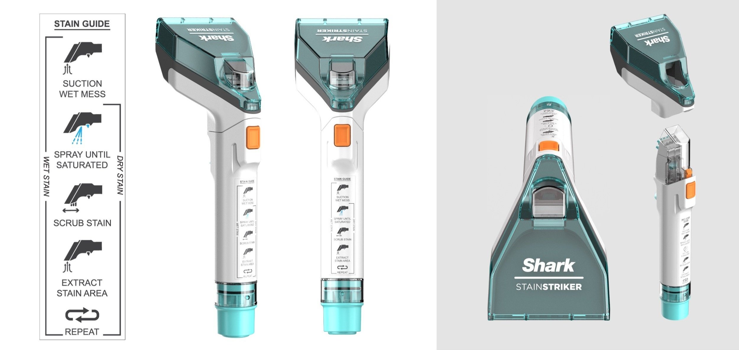
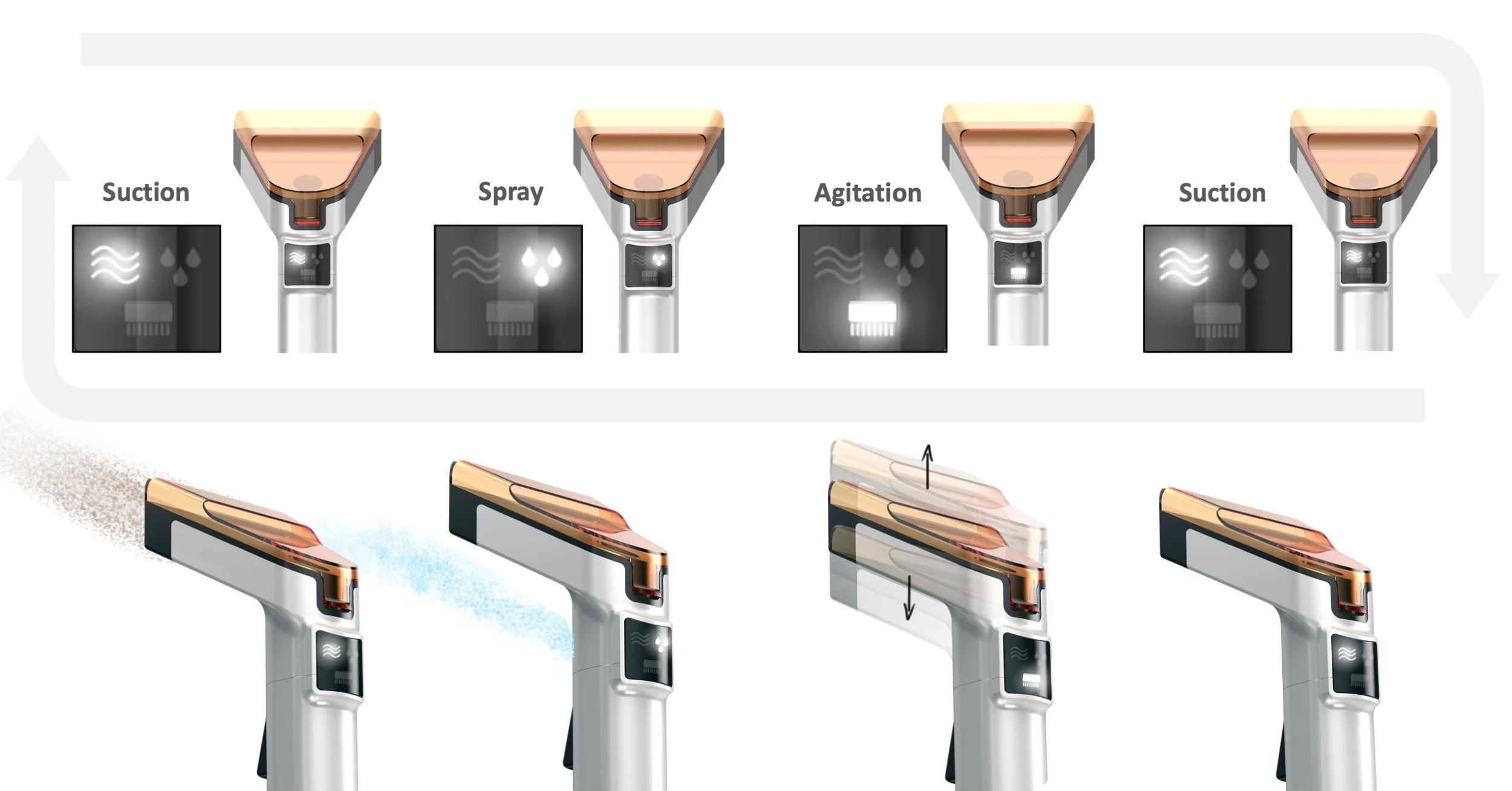
Throughout the P1 phase the ID team explored various hand tool refinements, with a key initiative to ensure that we communicated to the user the best way to operate the hand tool. We called this “the recipe.” The Recipe involves, first pre-sweeping the stain area, then spraying the stain, followed by agitating the stain, and finishing with extracting the stain. The team first looked at this approach with a UI.
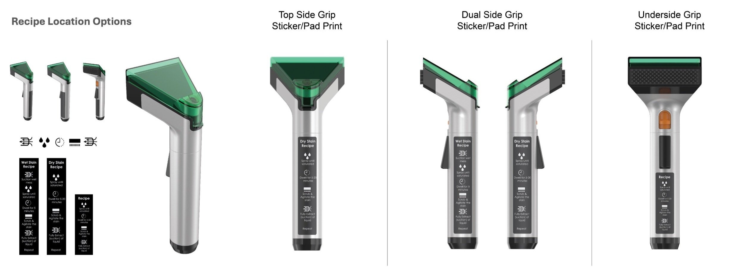
Triton - P1 ID: Hand Tool Recipe Refinement
The team backed away from the UI display due to costing and UX concerns. Instead, we looked at pad-print and sticker options to have the recipe live on the hand tool, always available for the user to reference.
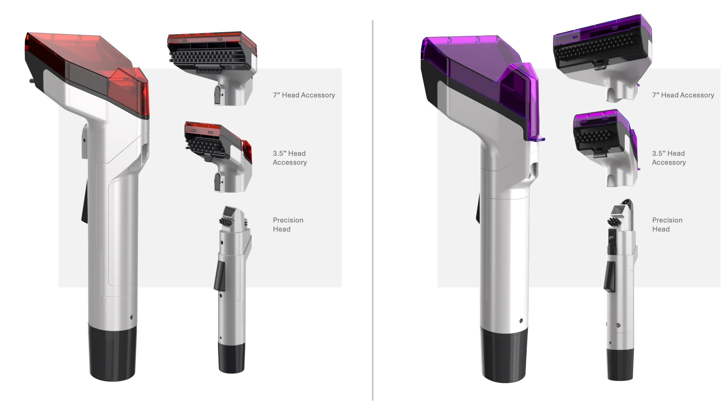
Triton - P1 ID: Hand Tool Refinement
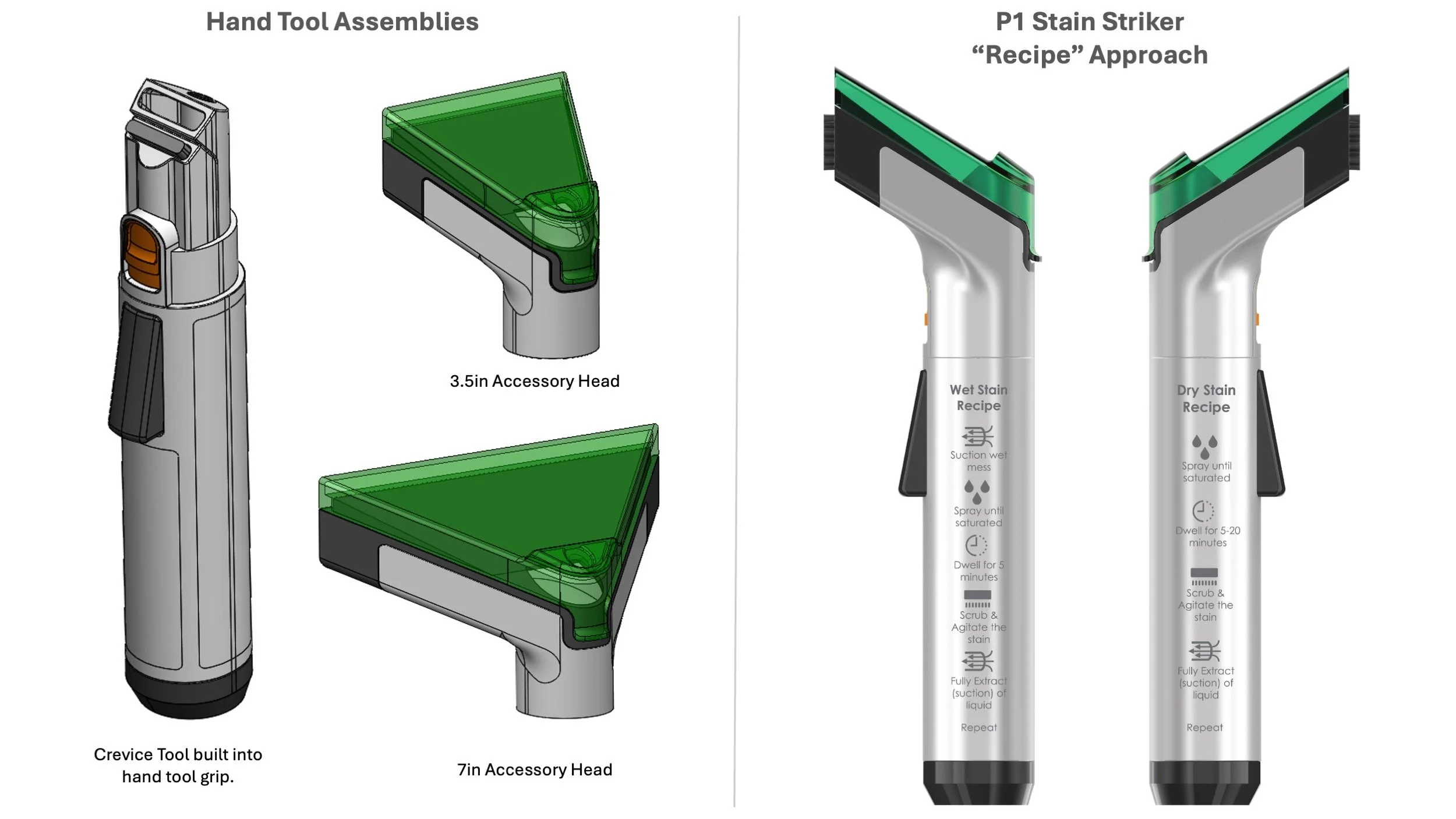
The final P1 hand tool design incorporated a suite of head accessories and on-board stain recipes. The spray is activated by the trigger on the underside and the spray comes from the top of the visor.
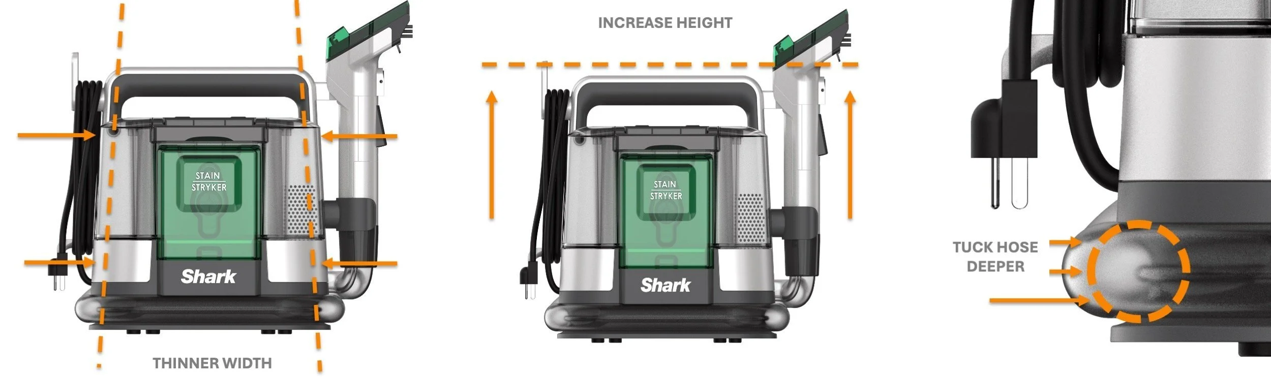
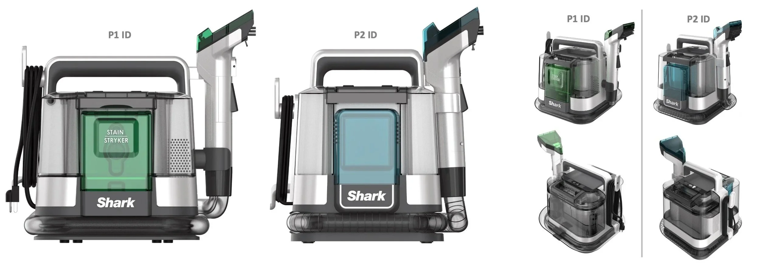
Triton - P2 ID: Proportion Refinement
The “cube” ID was gaining traction but the proportion, and design gesture could be enhanced by slimming and lifting the ID to feel more proud and elegant. ID identified some key areas for investigation.
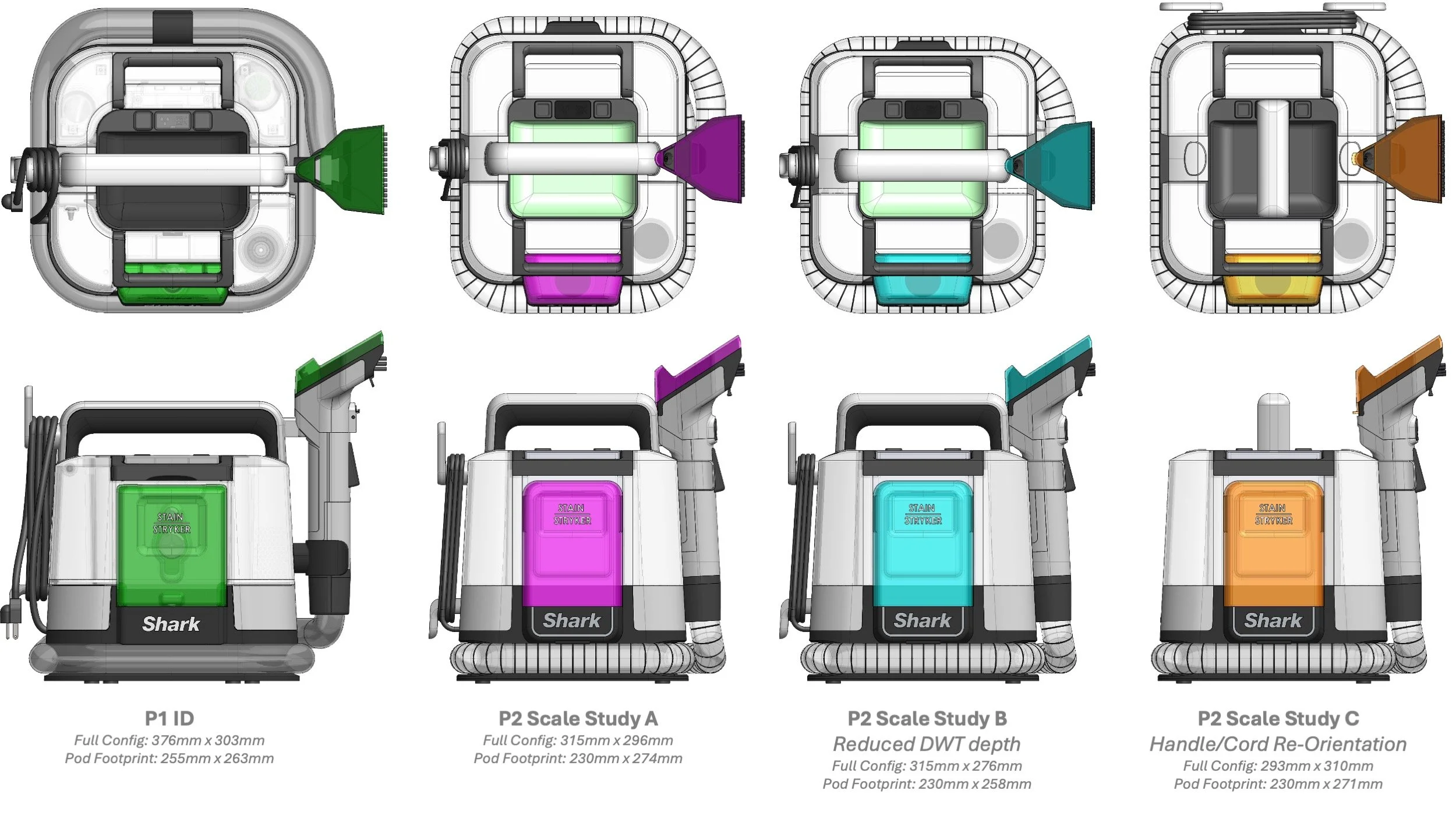
Triton - P2 ID: Scale Study
The team developed a matrix of size optimizations and aligned cross-functionally to proceed with the scale study A approach.
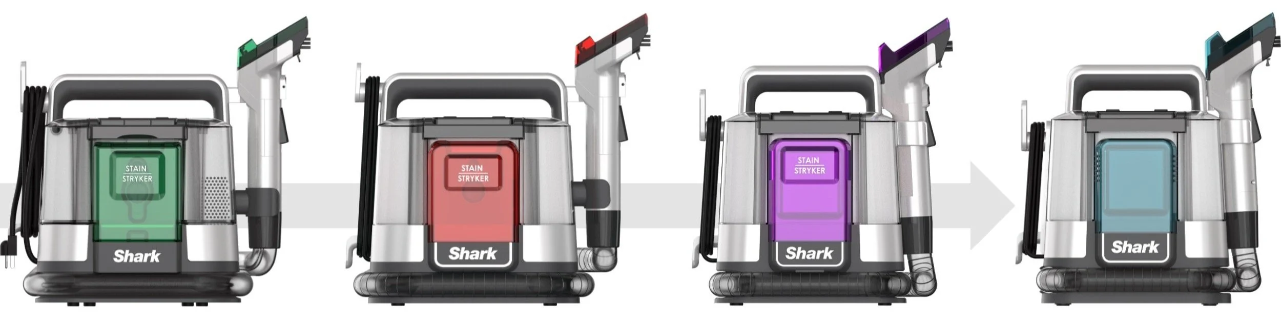
Triton - P2 ID: ID Proportion Evolution
Triton - P2 ID: Hand Tool Development
Hand tool development produced updated surfacing for engineering functionality needs, increasing the spray height, updated bristle cartridge insertion, and updated accessory head latching, among others.
Triton - P2 ID: ID Refinement Comparison
Triton - P2 ID: Refined Design
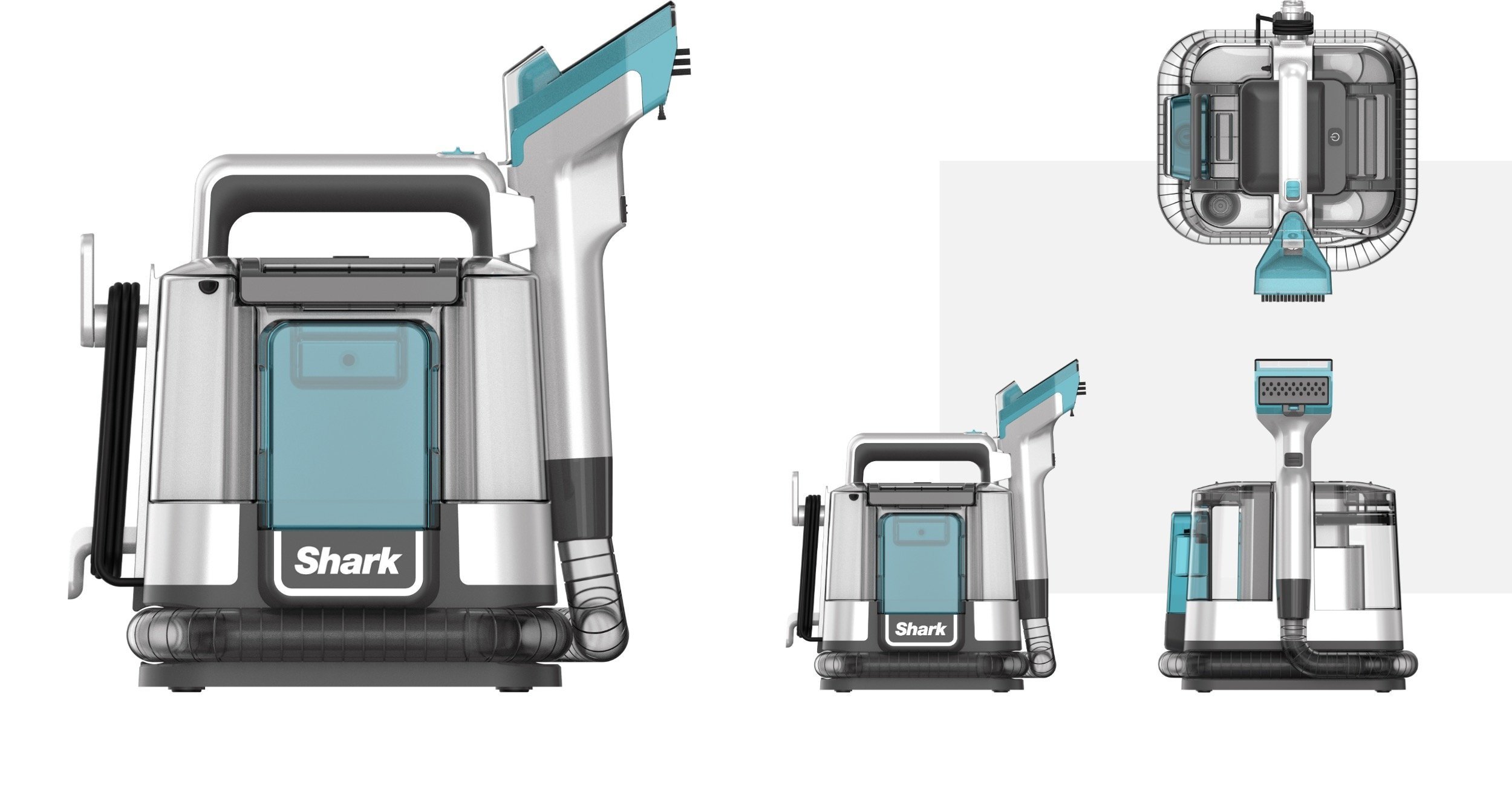
Trition - P2 ID: Refined Hand Tool Design
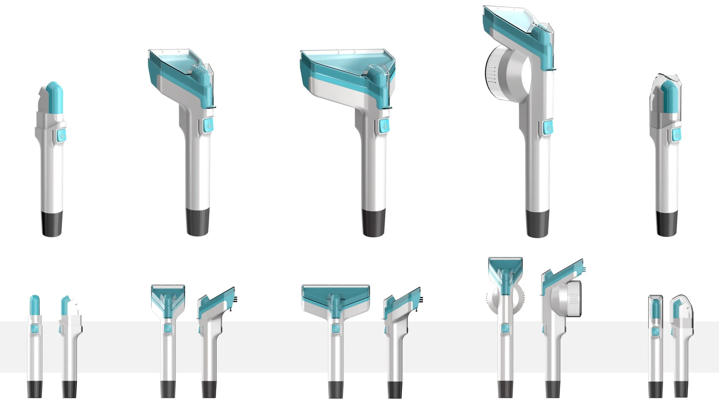
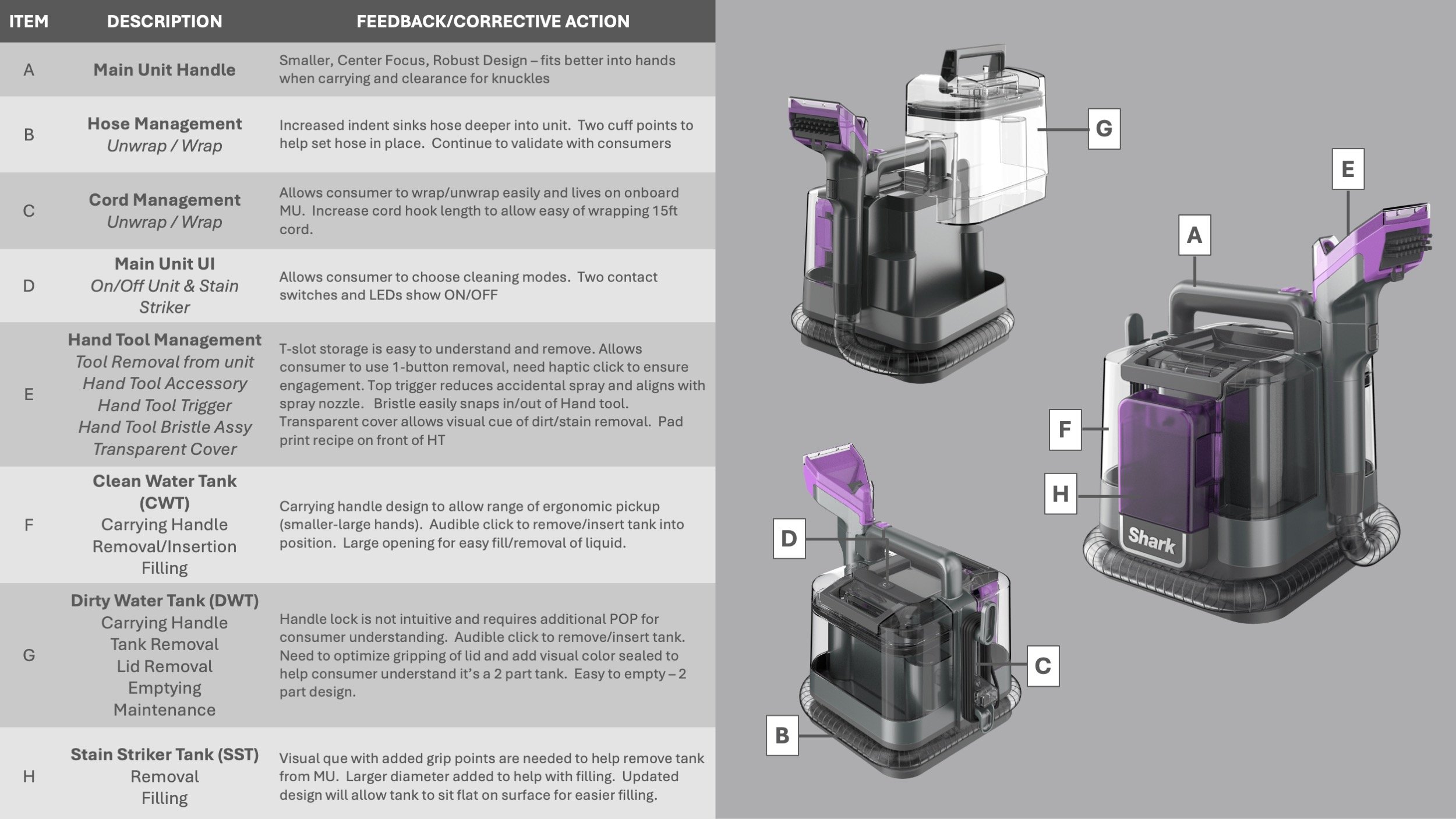
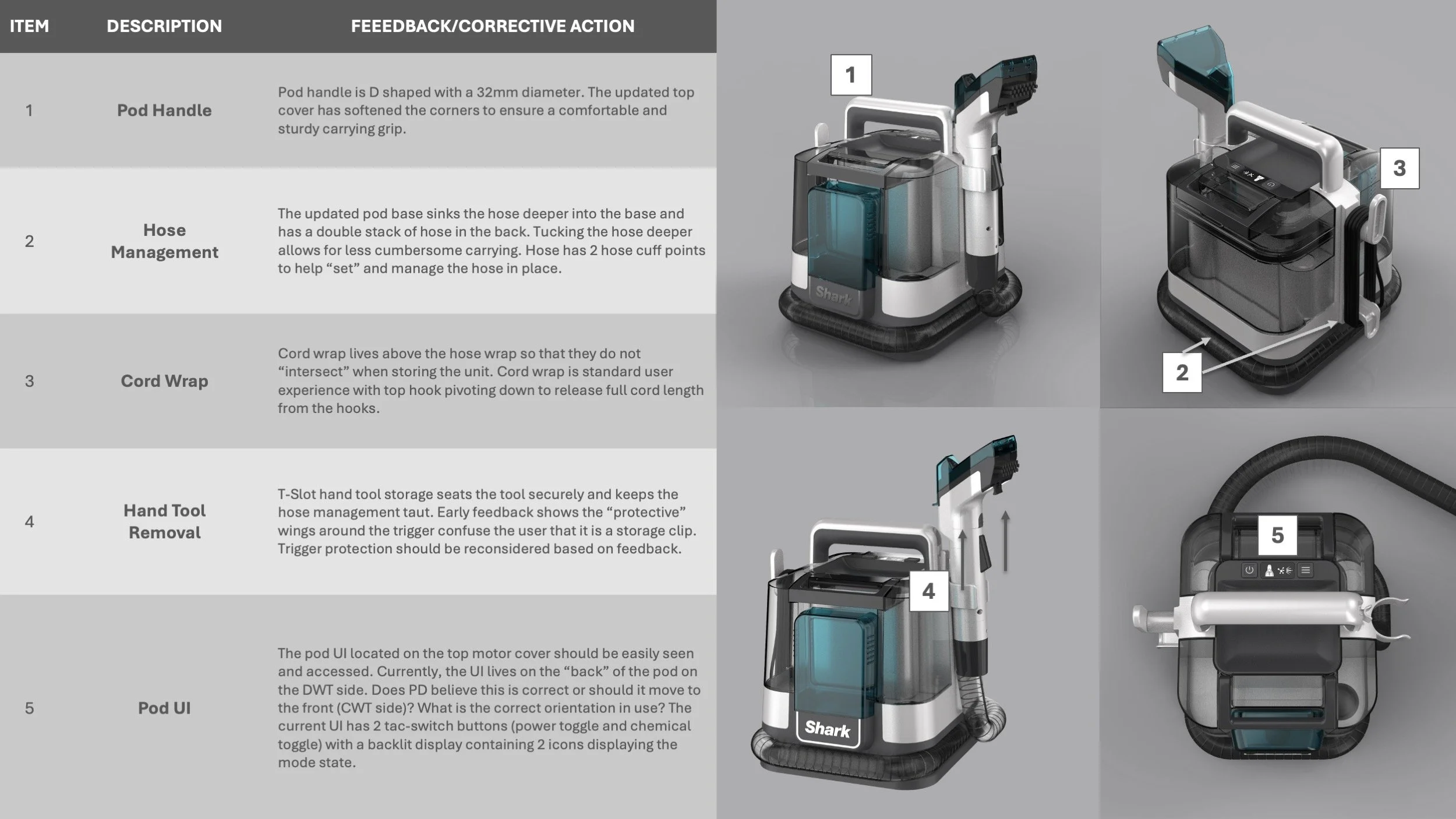
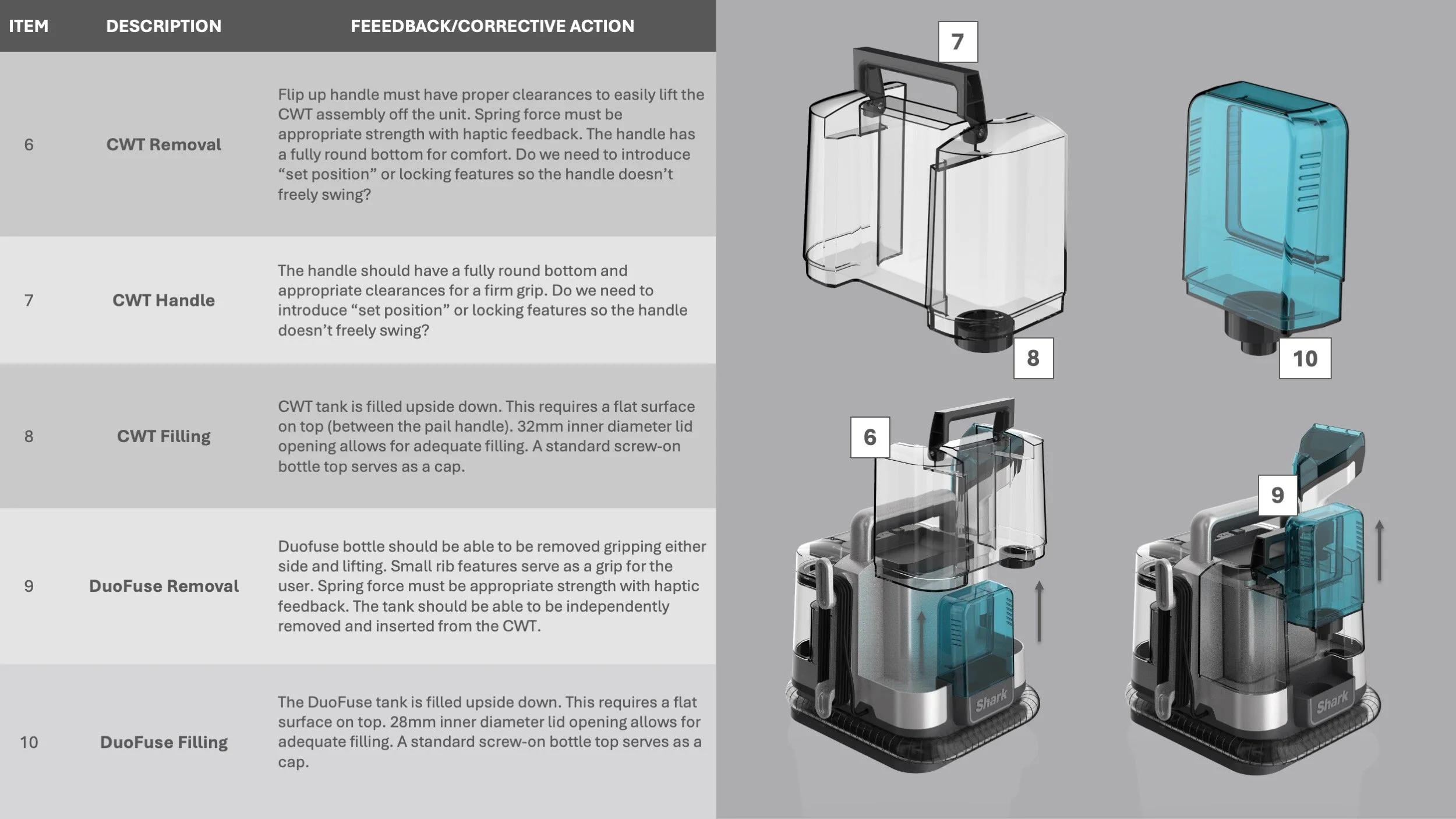
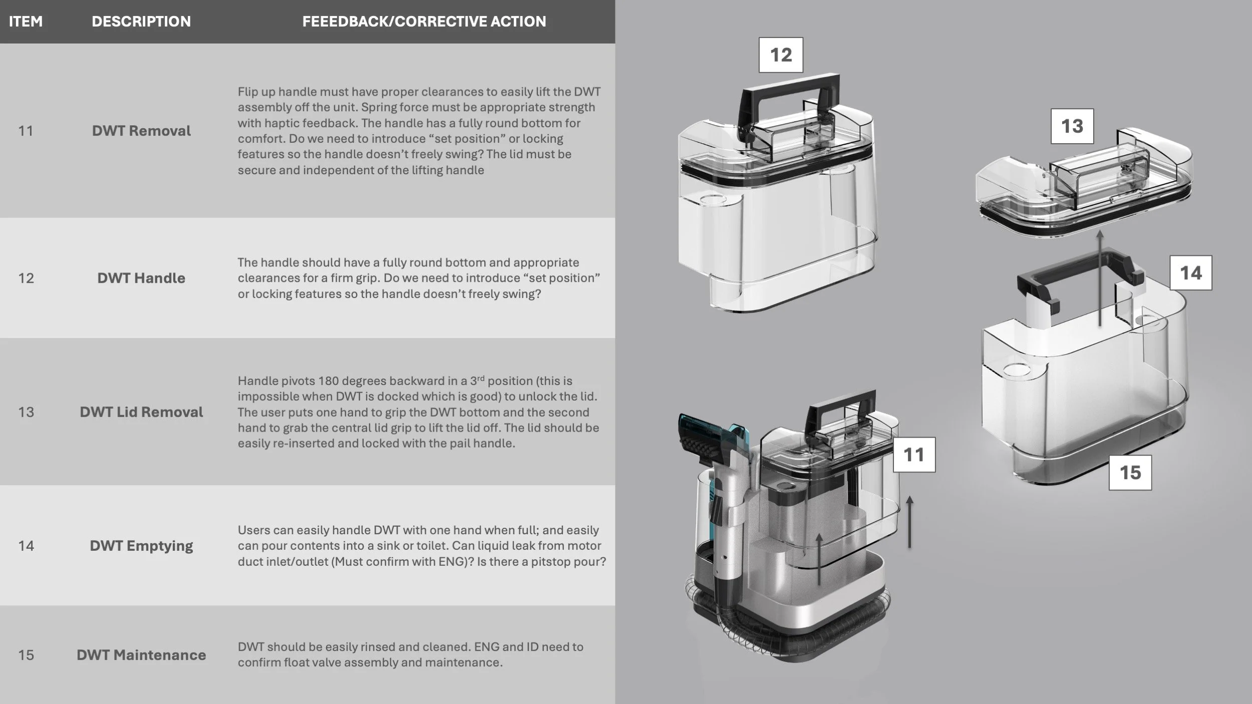
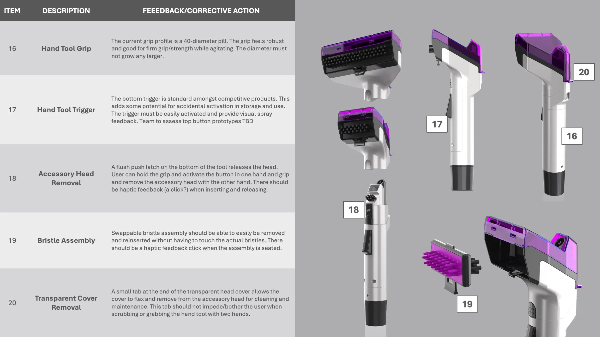
Triton - TRA ID: Deep-Dive
With no prototype builds left ahead of cutting steel, ID actioned a design “deep-dive” where we dissected all aspects of the design from asethetic to UX to ensure we were ready for tooling.
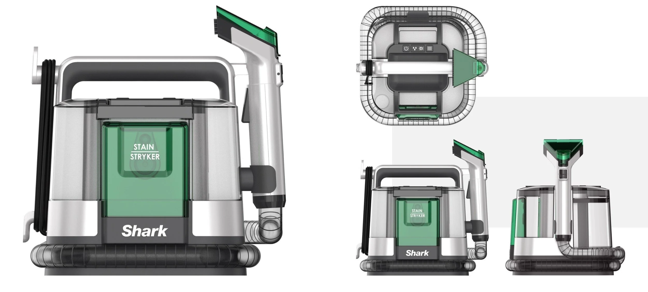
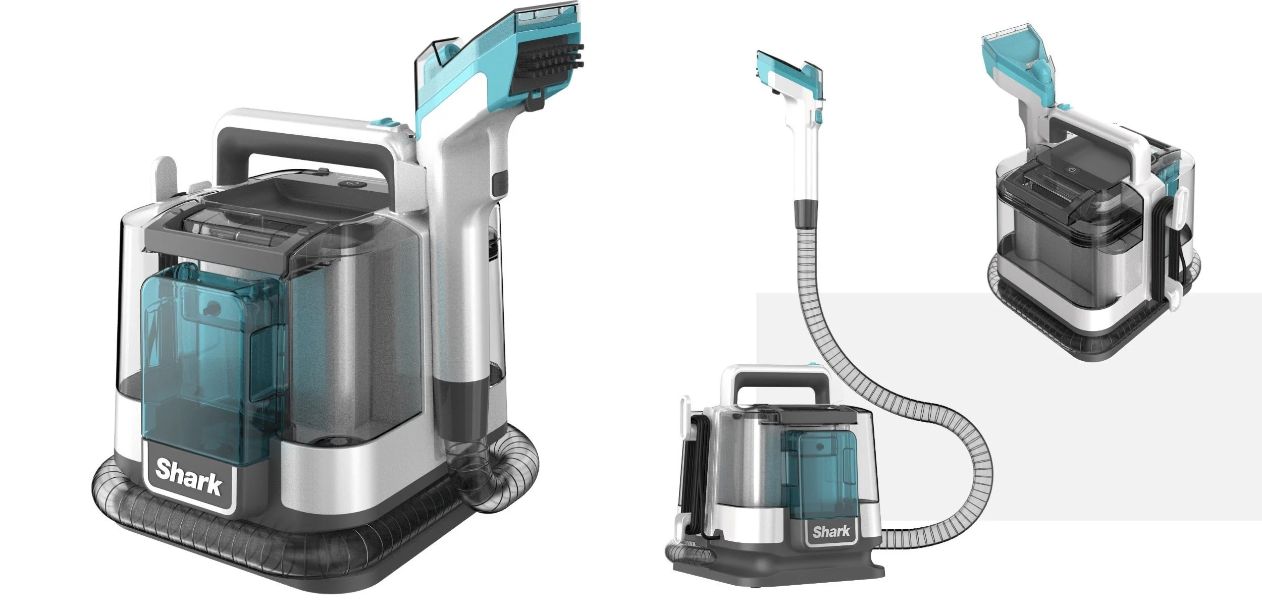
Triton - TRA ID: Refined Design
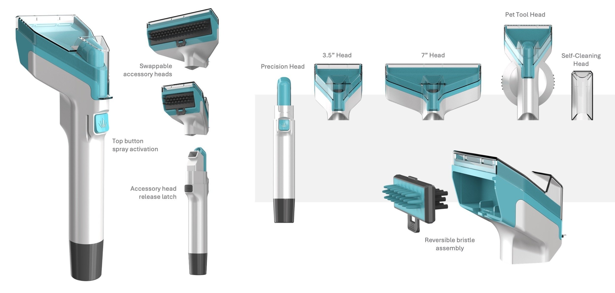
Triton - TRA ID: Hand Tool Refinement
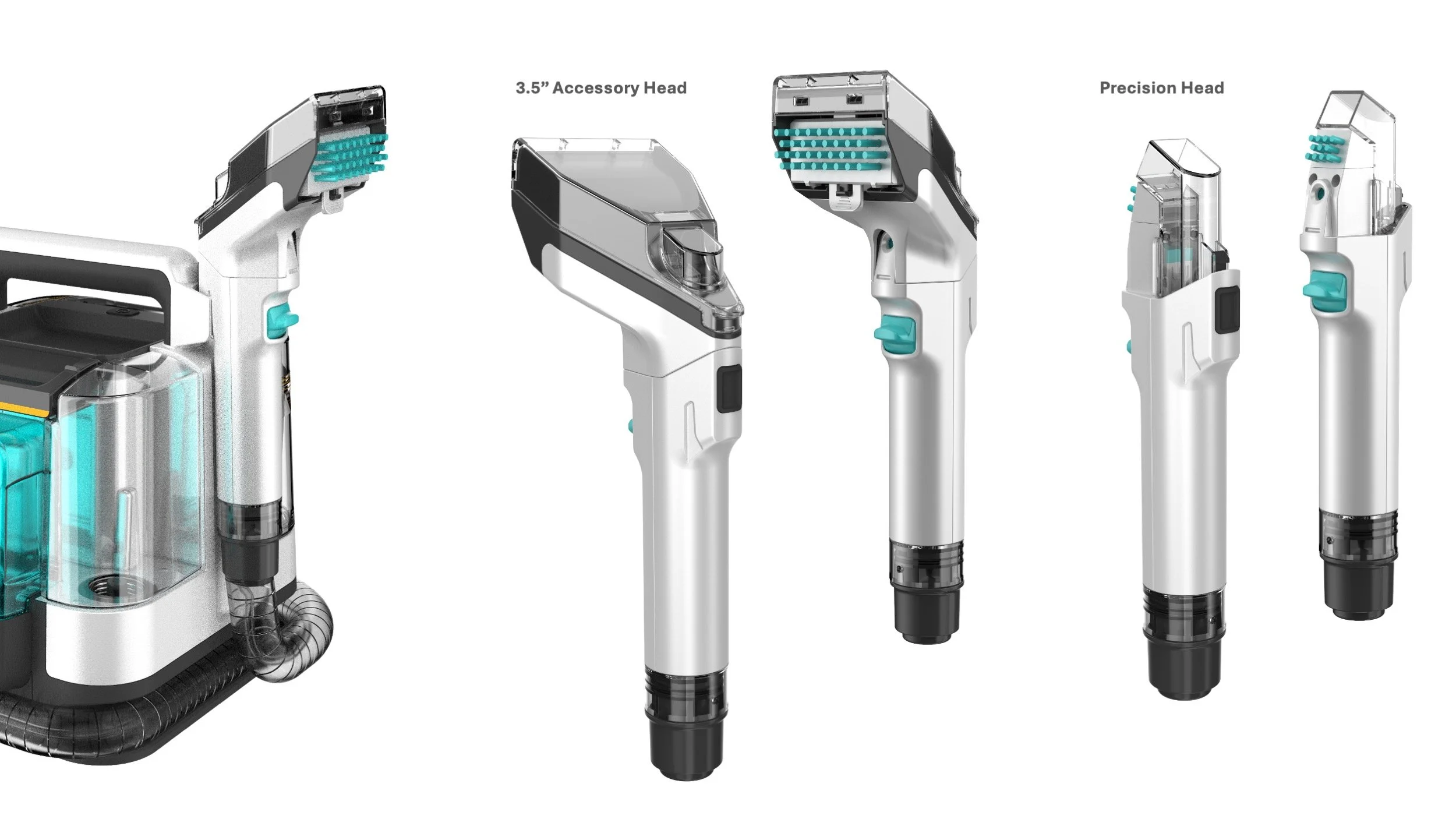
The team elected to have a parallel path for the hand tool. The primary path would locate the spray on the top of the tool and have a top spray button activation. The secondary path would locate the spray on the bottom of the tool and have a bottom spray trigger activation. Upon further testing, the bottom spray location with bottom trigger approach became the clear front runner for mass production.
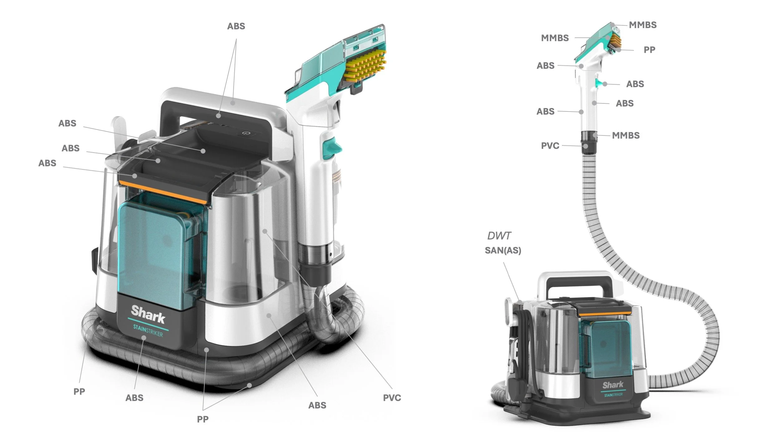
Triton - TRA ID: Aligned Materials Spec
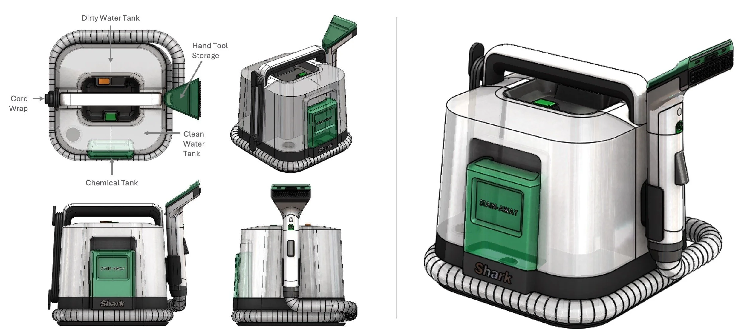
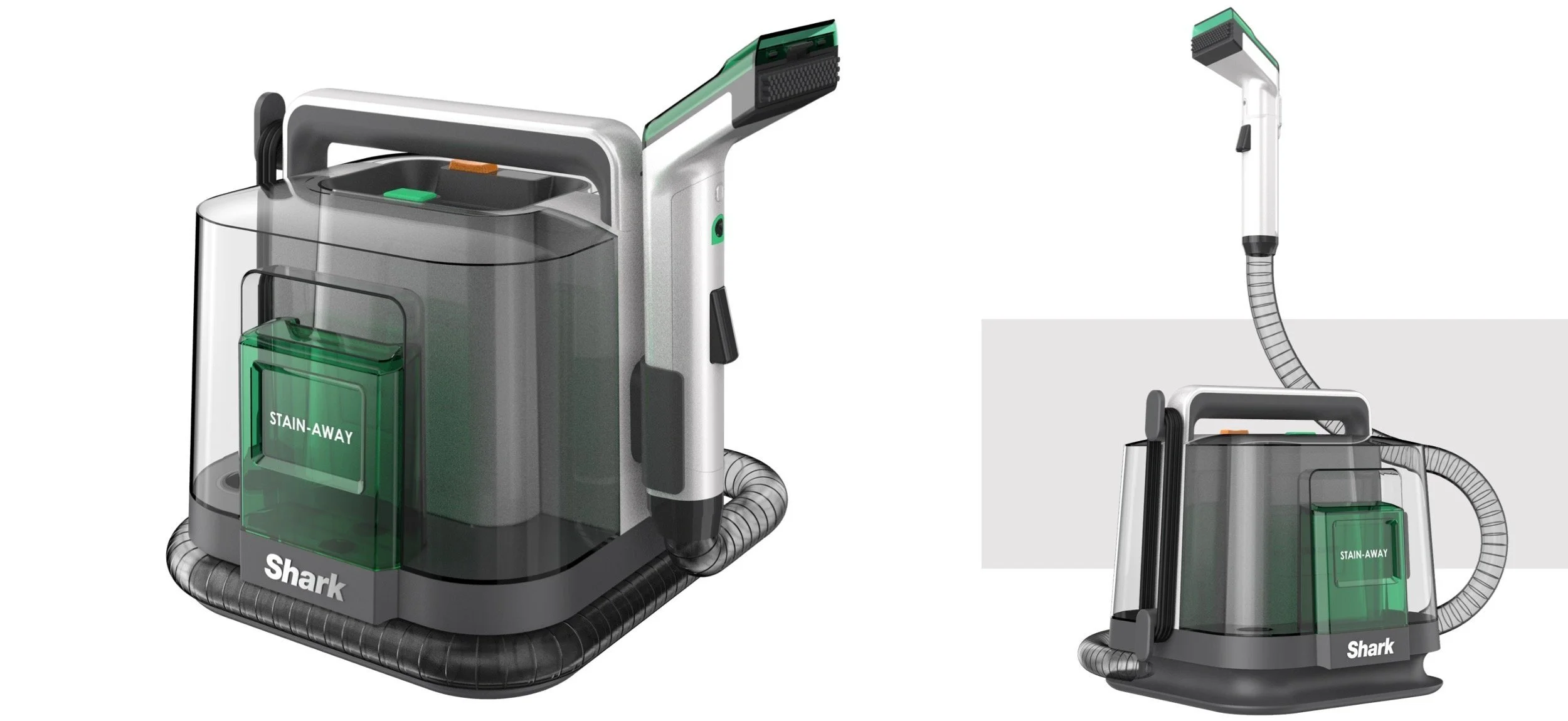
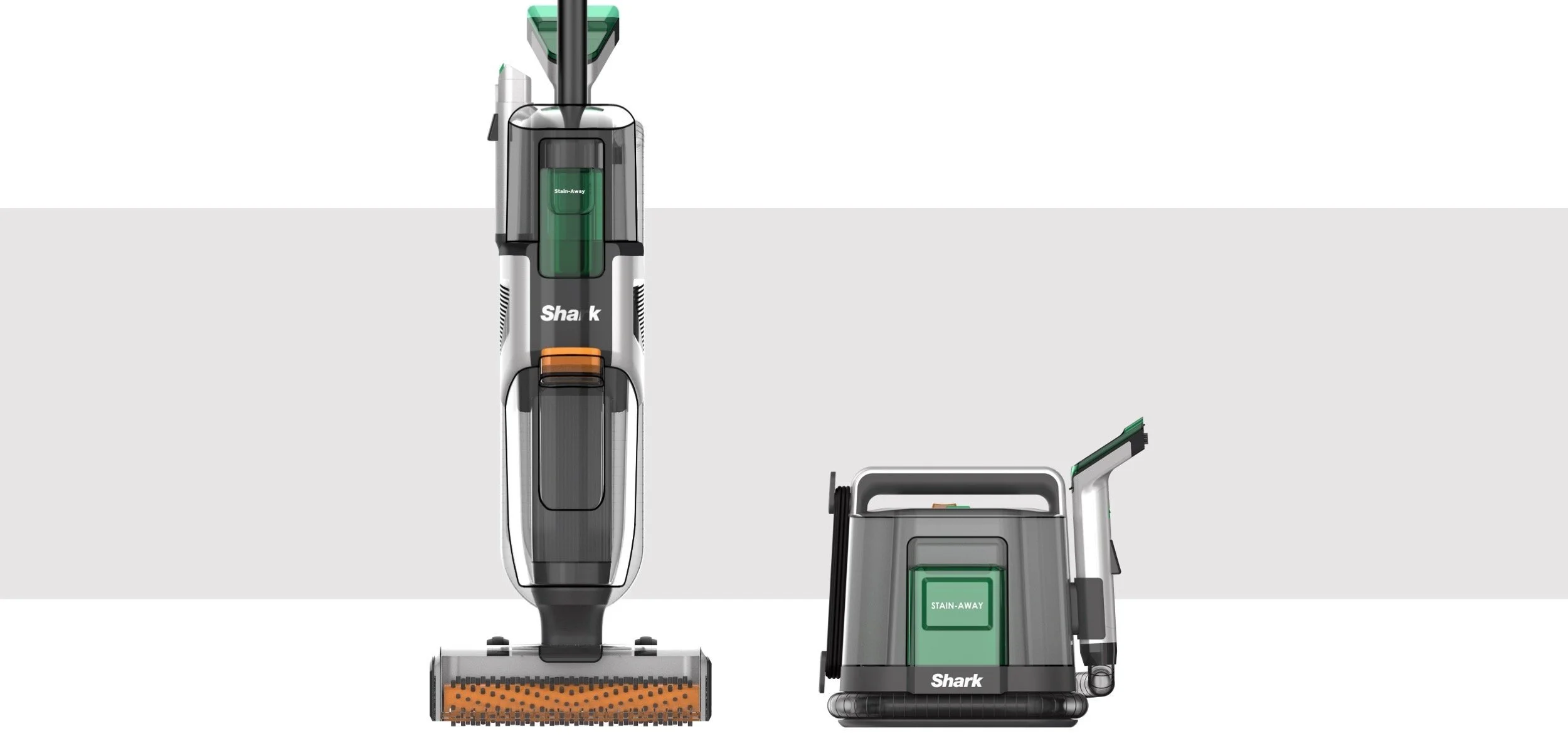
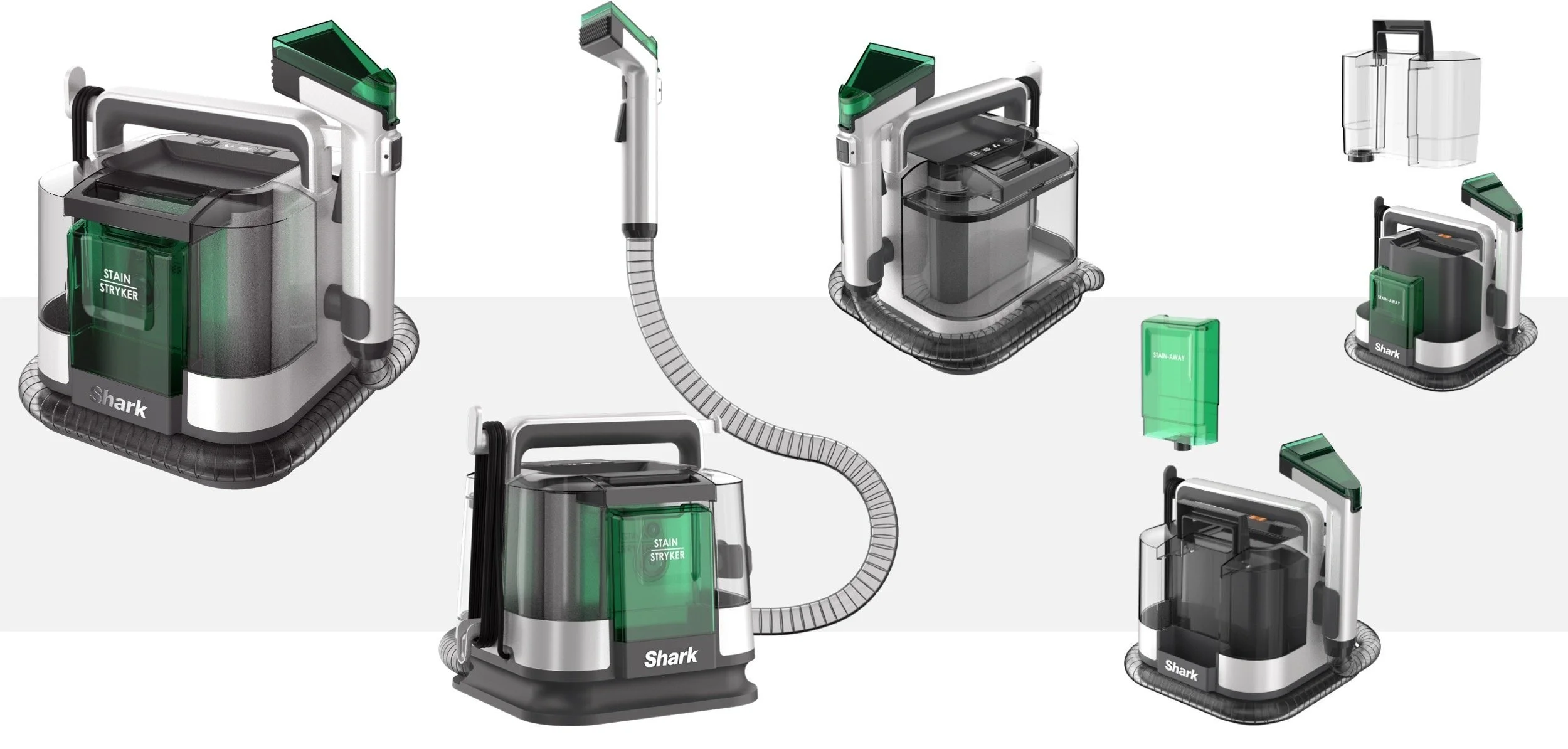
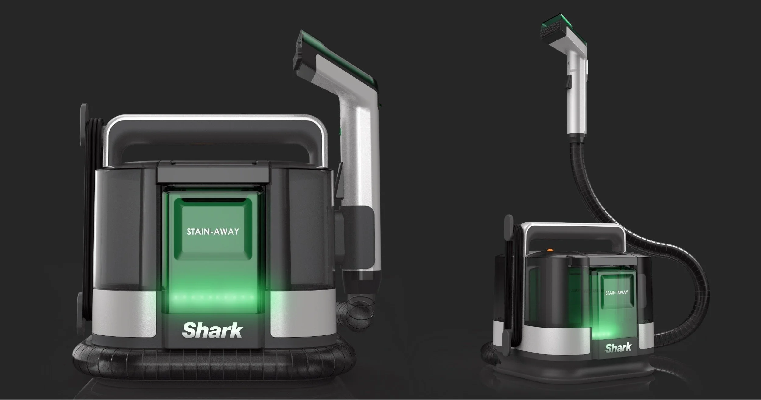
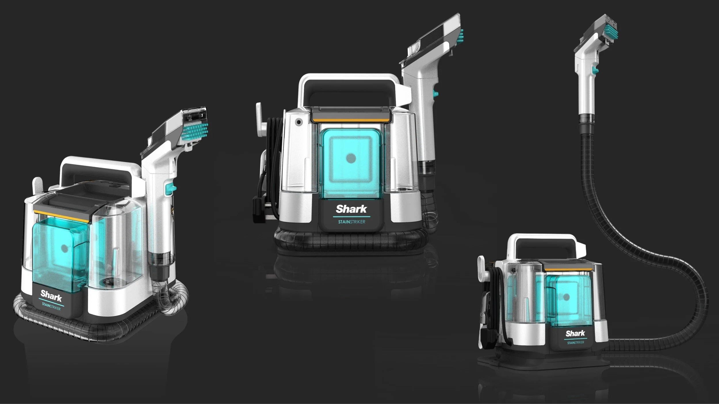
Triton - Post-TRA ID: Engineering Builds
After tooling the program had 3 Engineering Builds to further refined the design for optimized performance and finalized on-product branding, pad-prints, and CMF.